




Xianlin SciCity Group: A Brand Identity for a Science City That Keeps Growing
Urban development, 人工智能, 金融地产
Xianlin SciCity Group
Brand World / Identity
Brand overview
Client: Nanjing Xianlin SciCity Group Co., Ltd. (南京仙林科学城集团有限公司)
Former name: Nanjing Qixia Hi-Tech Industry Group Co., Ltd. (南京栖霞高新产业集团有限公司), renamed in September 2026
Profile: a state-owned enterprise of Qixia District, Nanjing, founded in 2017 and wholly owned by Nanjing Qixia Urban Development Group Co., Ltd.
Year: started in July 2026, before the formal name change
Xinming Design's scope: brand strategy and brand world, group logo, core visual identity system, Visual OS asset standards
Agency: Xinming Design
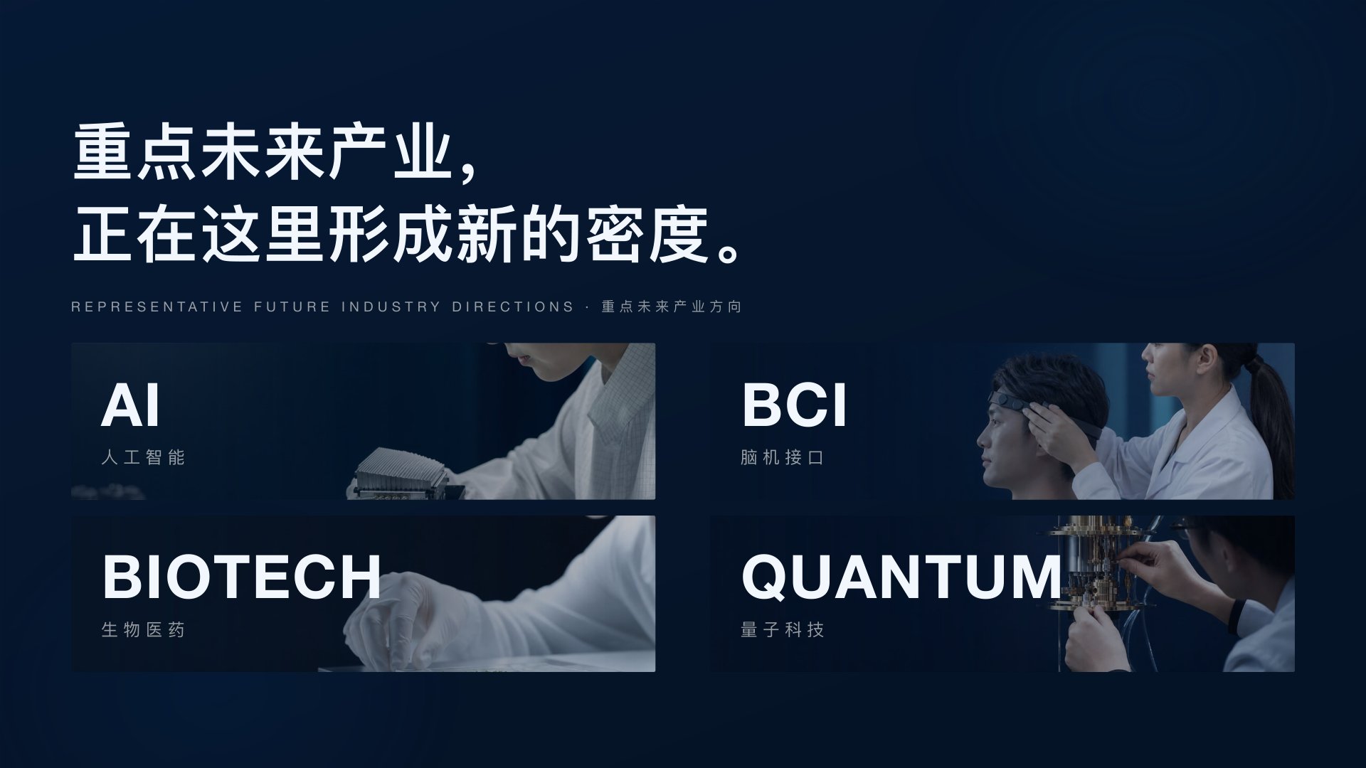
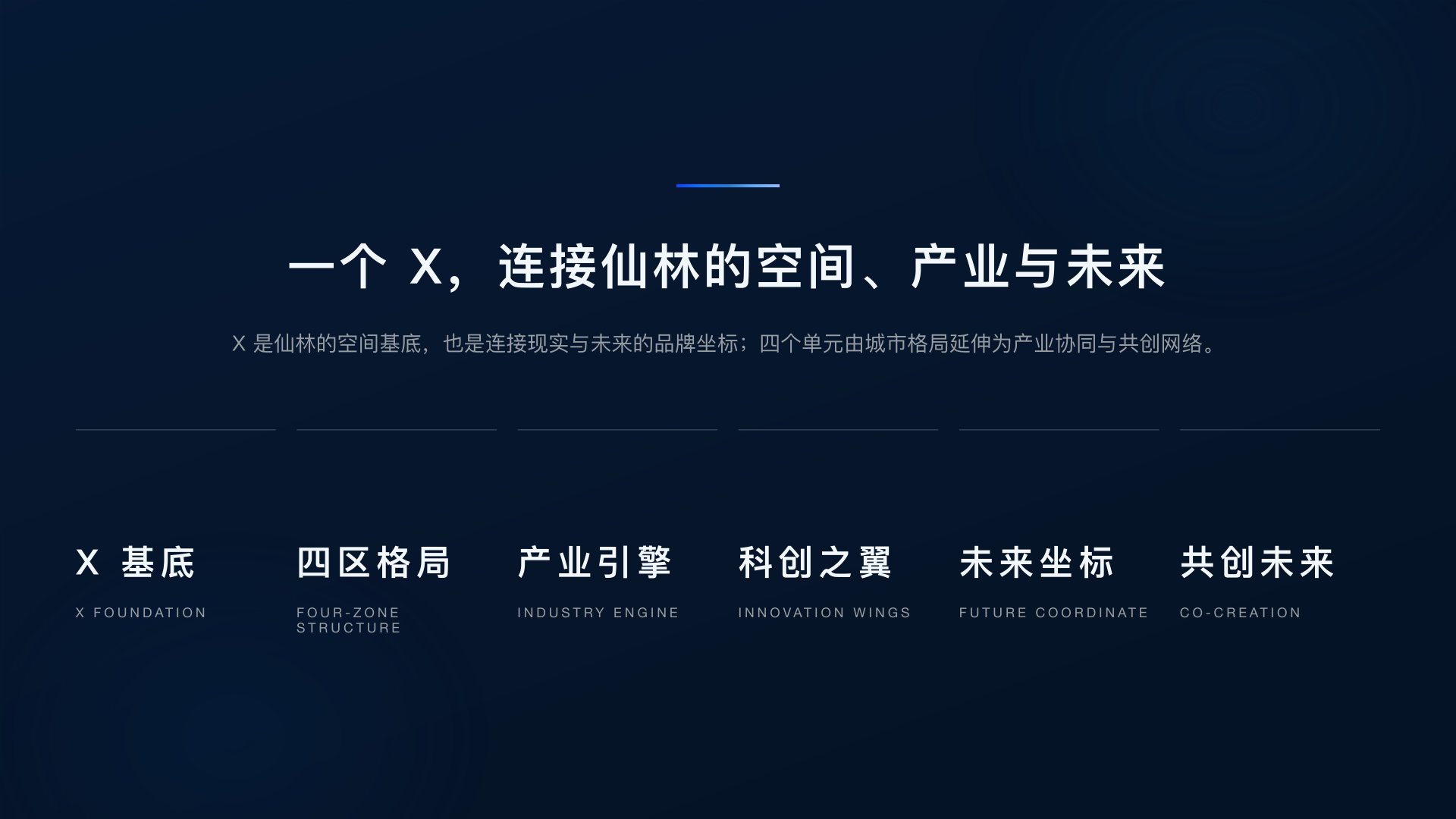

One X, one rainforest
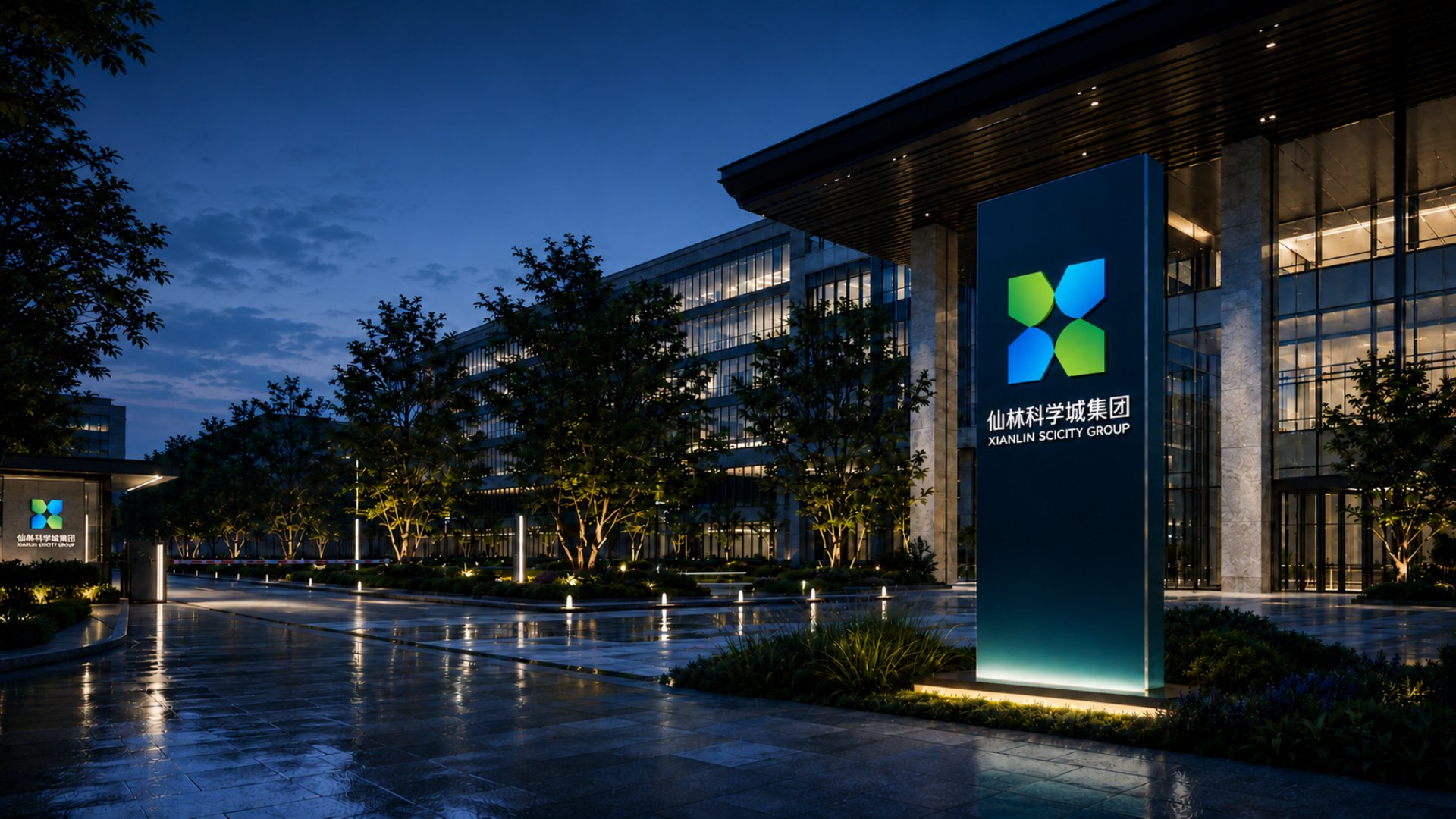
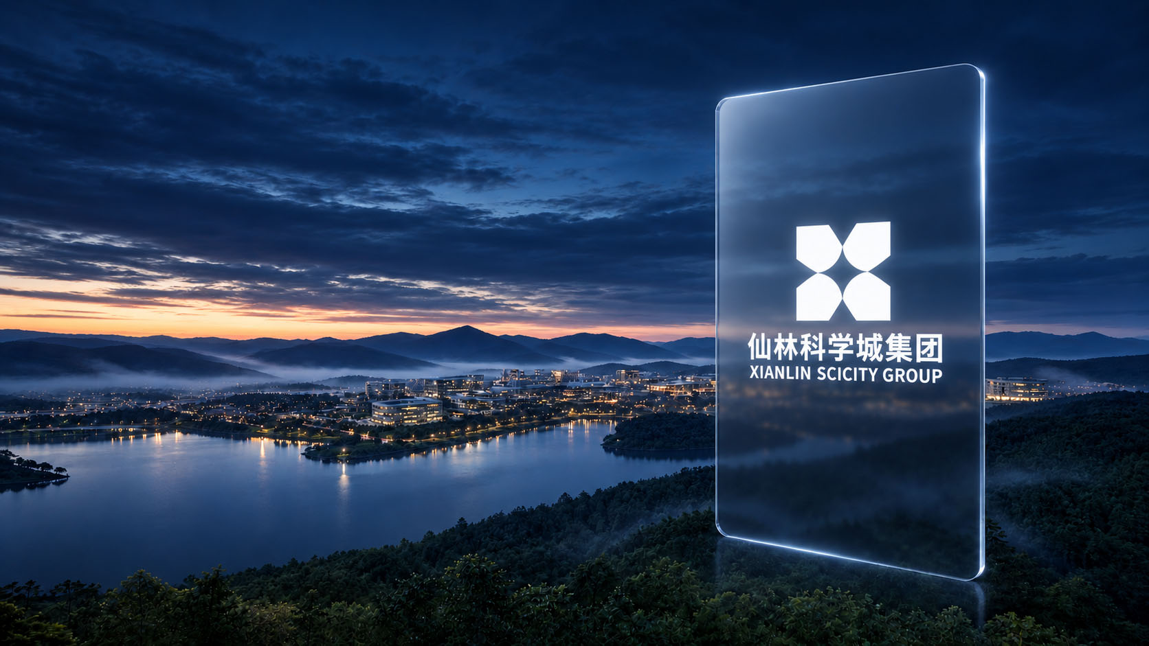
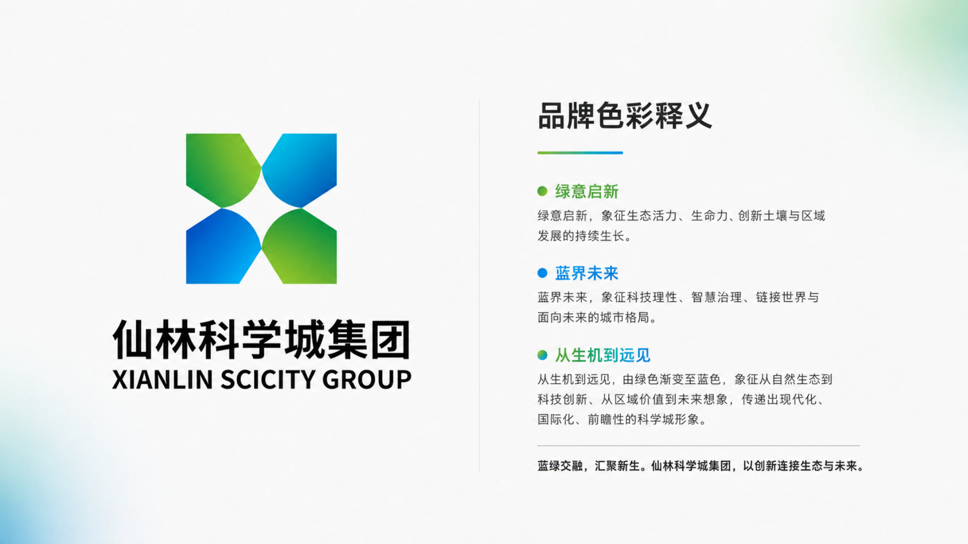
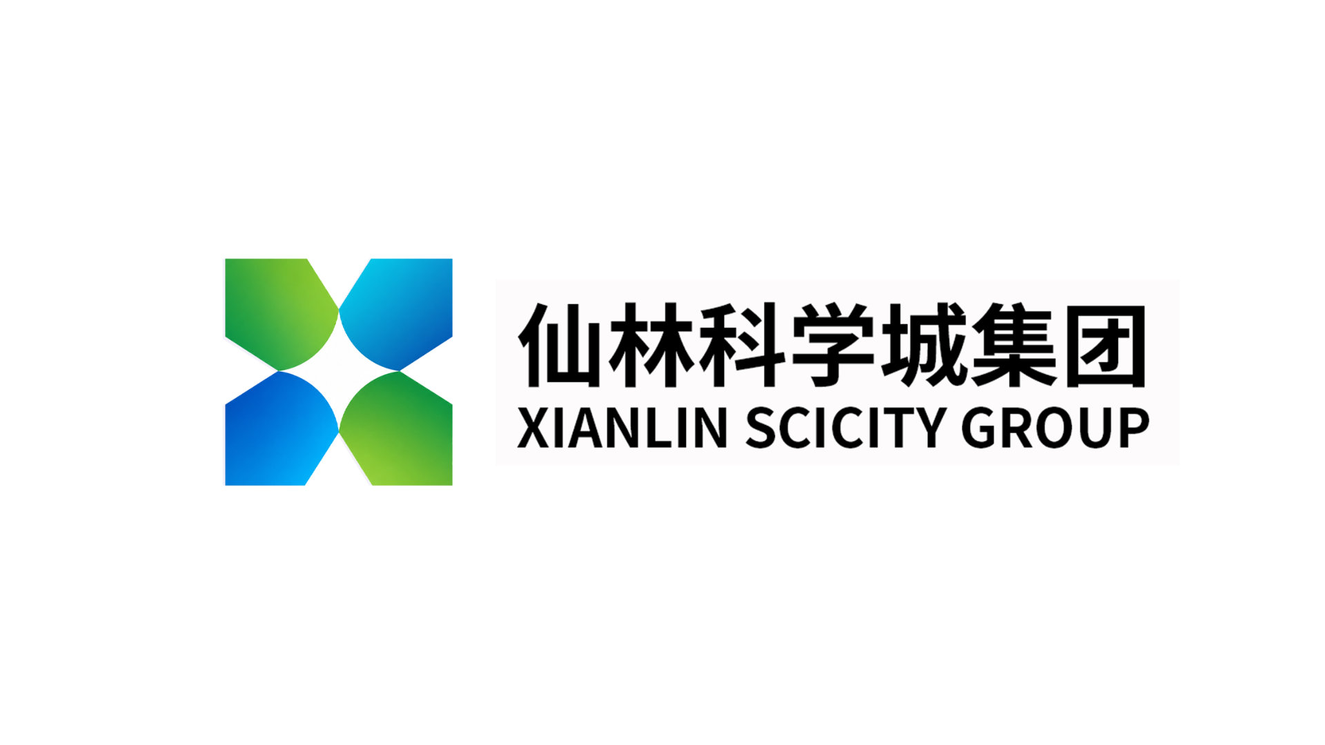
In July 2026, as Nanjing Qixia Hi-Tech Industry Group prepared to become Nanjing Xianlin SciCity Group, it commissioned Xinming Design to build the brand for its new name; the name itself was set by the group's superior authorities. Xinming Design developed "Innovation Rainforest" as the brand world and designed the group logo: four geometric units enclose the letter X, and at the centre a four-pointed star forms naturally from the negative space. The upper-left and lower-right units carry a green gradient; the upper-right and lower-left carry blue gradients. The X answers the name Xianlin and also echoes the meeting of the Lingshan mountains and the Jiuxiang River; the four units correspond to the science city's four zones; the central star is its "future coordinate". On this basis, Xinming Design built a core visual identity system and a set of Visual OS asset standards. The company completed its formal name change in September 2026.
A new name has to be recognised by many people at once
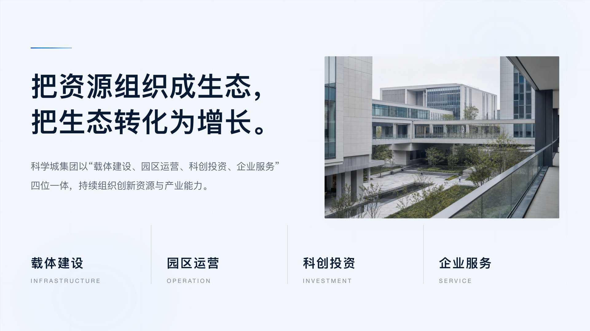
Nanjing Xianlin SciCity Group was founded in November 2017 as Nanjing Qixia Hi-Tech Industry Group and took its current name in September 2026. It is registered in Xianlin Subdistrict, Qixia District, Nanjing, and is a district-level state-owned enterprise wholly owned by Nanjing Qixia Urban Development Group. According to its business registration profile, the group focuses on sectors including new medicine and life health, and artificial intelligence. As the proposal summarises it, the group works across four integrated roles: building infrastructure, operating parks, investing in innovation and serving companies.
Xianlin Science City is a key part of Nanjing's Zijinshan Innovation Belt. According to public reports from an August 2026 Qixia District planning meeting, it is positioned as one of the belt's innovation source and service centres, drawing on a dense cluster of universities for basic research, technology development and commercialisation.
A new name means facing government, universities, companies, talent and the public under a new identity, all at once and in a short time. A new group brand is easiest to start from visuals: how to draw the logo, which colours to use, how to design business cards and signage. But if those are the only questions answered, the design is likely to be back at square one within two or three years.
A science city never has just one business. Industry services, talent services, park operations and new business vehicles will all join the same brand. The real question is this: when brand touchpoints grow from a handful to dozens, why should they still look like they belong to the same Xianlin SciCity?
From knowledge density to industrial density
So the proposal did not start with the logo. It started by answering what Xianlin is, in a line of reasoning set out in its first half:
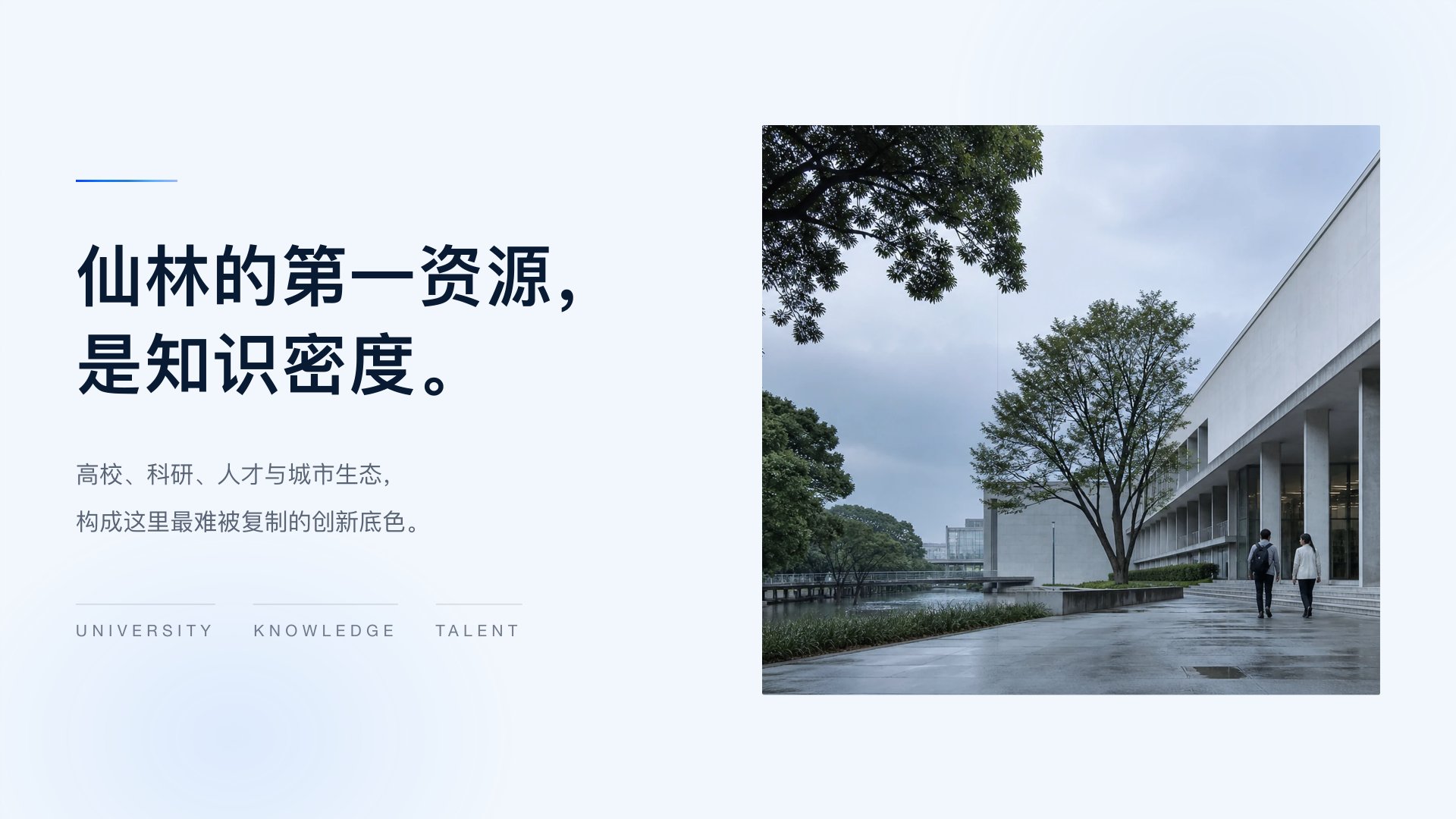
· Starting point: Xianlin's first resource is knowledge density. Universities, research, talent and the urban environment form a base for innovation that is hard to copy.
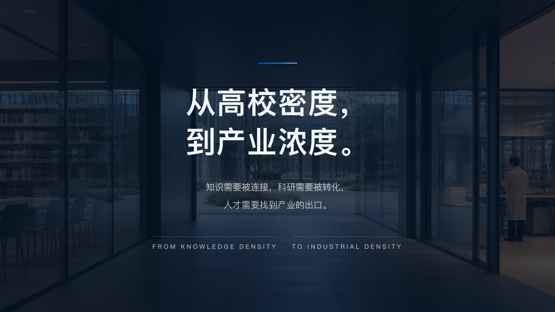
· The gap: between a density of universities and a density of industry lie three tasks: knowledge needs to be connected, research needs to be commercialised, and talent needs a way into industry.
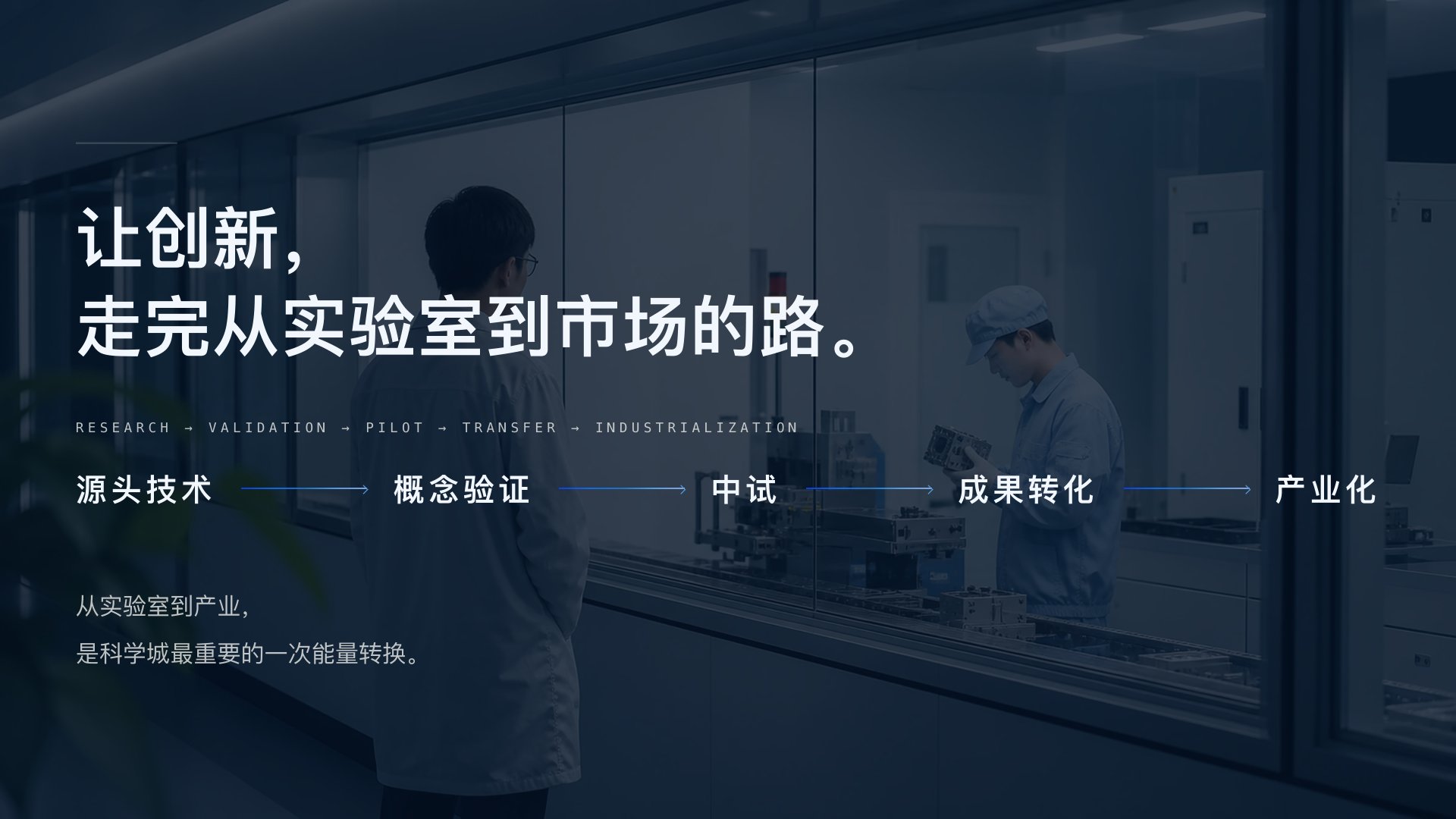
· The path: taking innovation all the way from lab to market, through source technology, proof of concept, pilot testing, commercialisation and industrialisation.
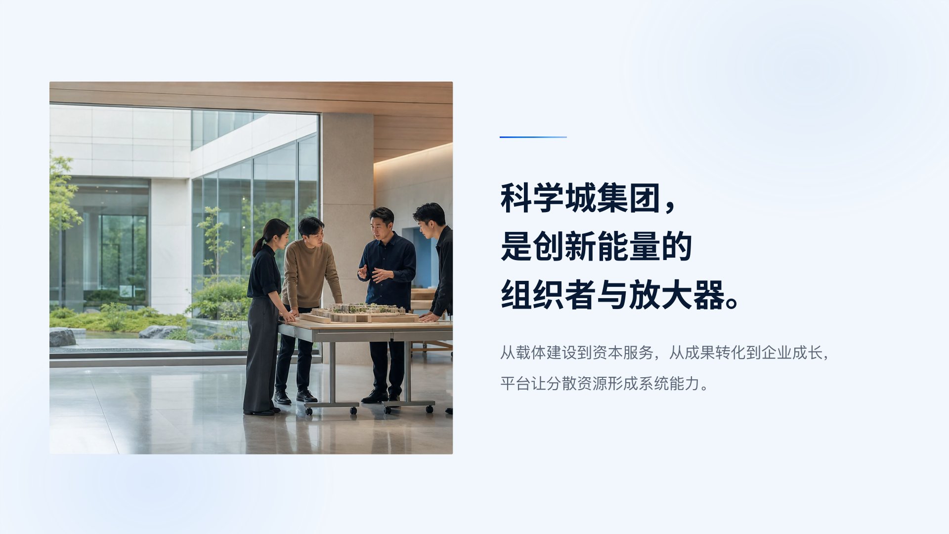
· The role: the science city group is the organiser and amplifier of innovation energy. From infrastructure to capital services, from commercialisation to company growth, the platform turns scattered resources into a system.
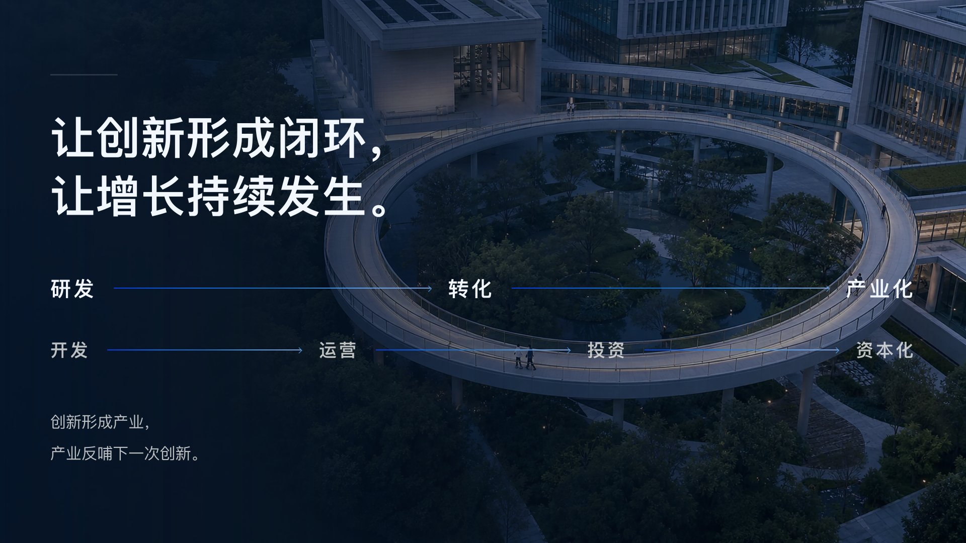
· The loop: research, commercialisation, industrialisation; development, operation, investment, capitalisation. Innovation becomes industry, and industry feeds the next round of innovation.
That reasoning fixed the brand's position: the group is not the landlord of a park but the organiser of an ecosystem. What the brand has to express is not a building or a technology, but organisation itself.
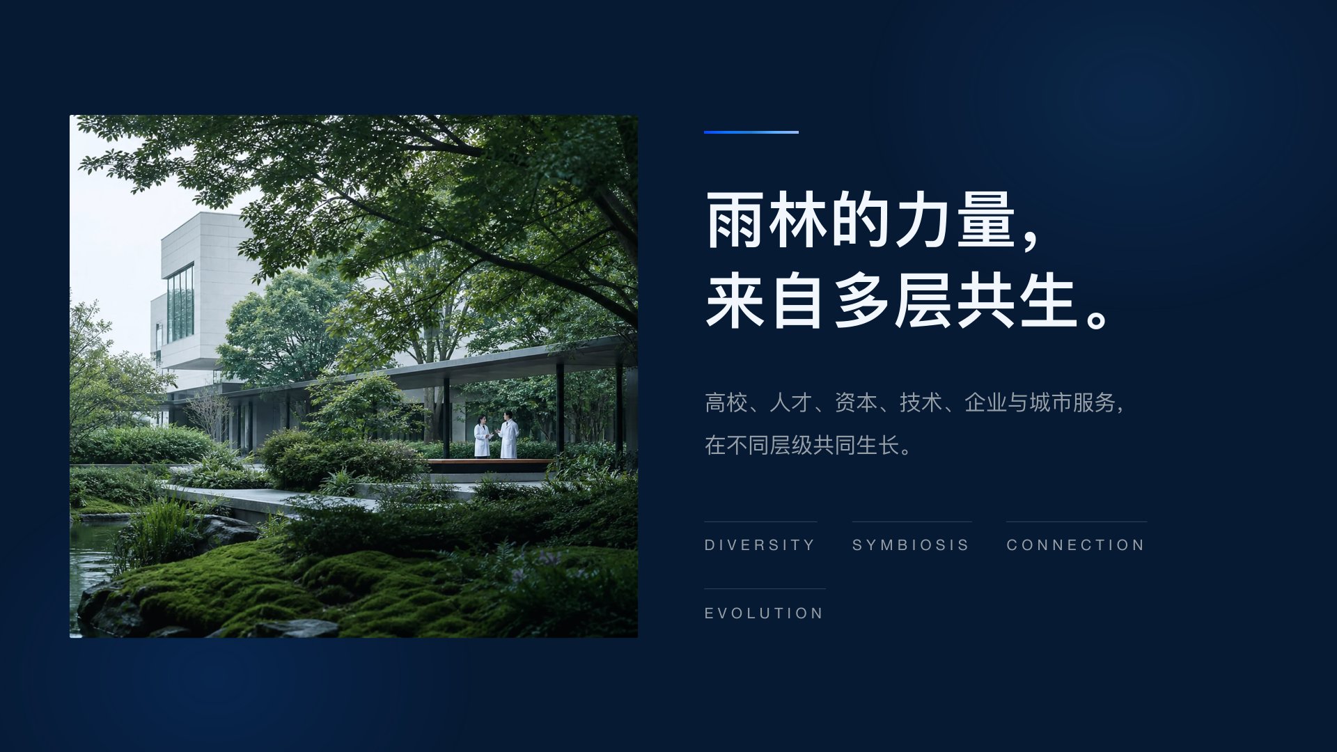
Innovation Rainforest: strength from many layers living together
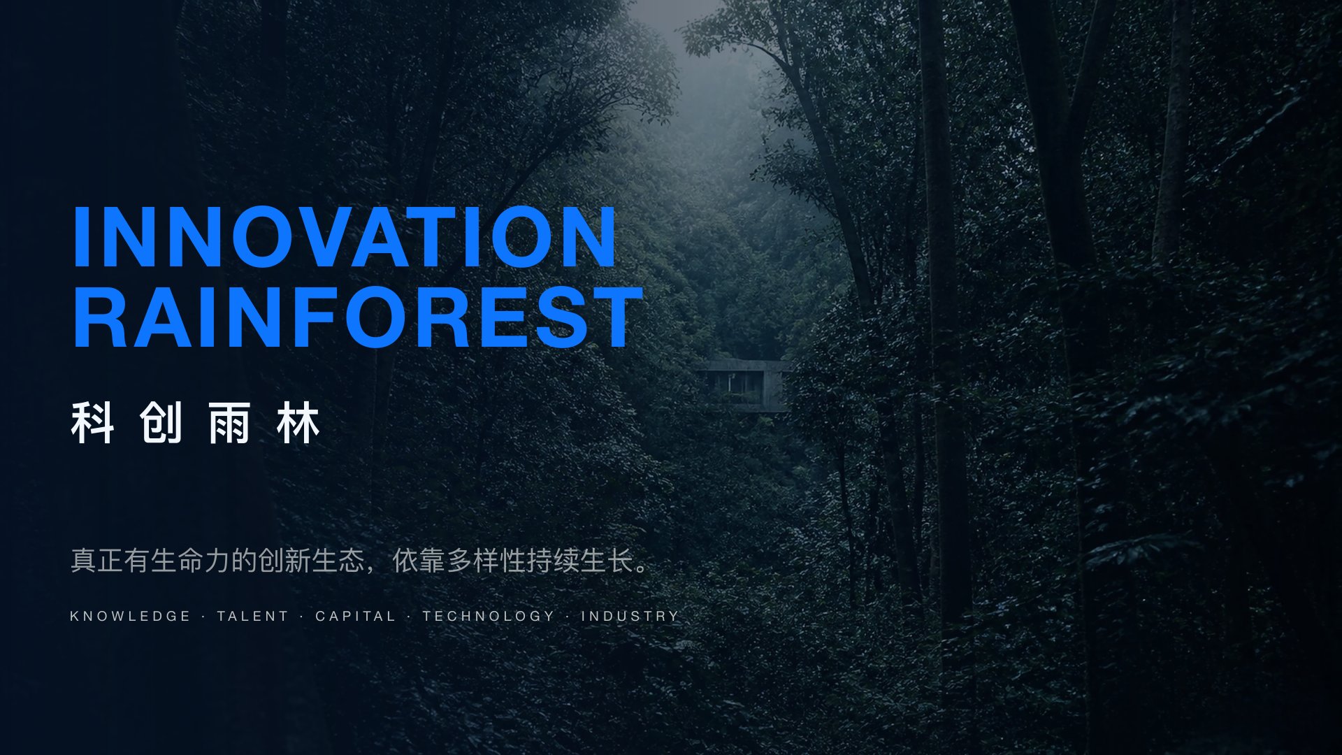
From there, the proposal put forward "Innovation Rainforest" as the brand world: "A truly living innovation ecosystem grows through diversity."
The proposal maps several features of a rainforest onto relationships in the science city:
· Many layers living together: universities, talent, capital, technology, companies and city services growing at different levels;
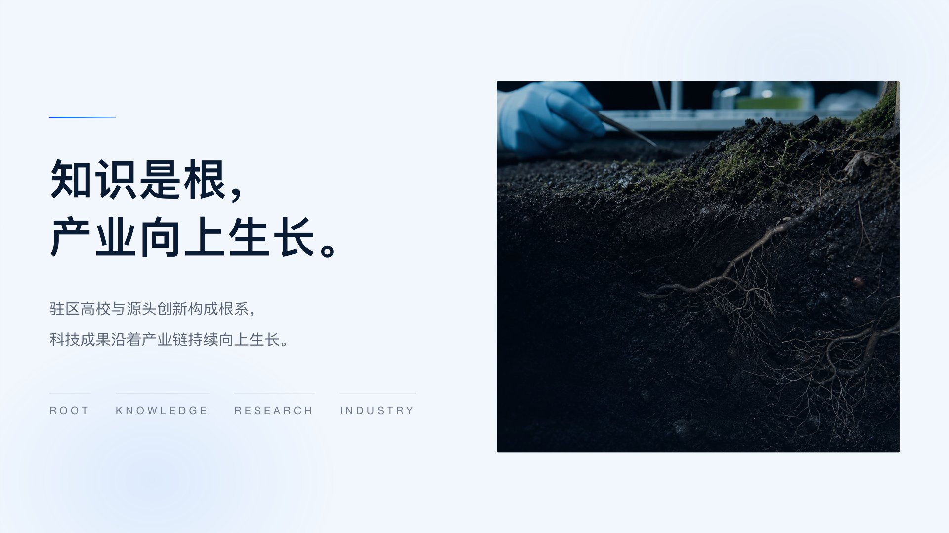
· Knowledge as the roots, industry growing upward: resident universities and source innovation form the roots, and research results grow upward along the industrial chain;
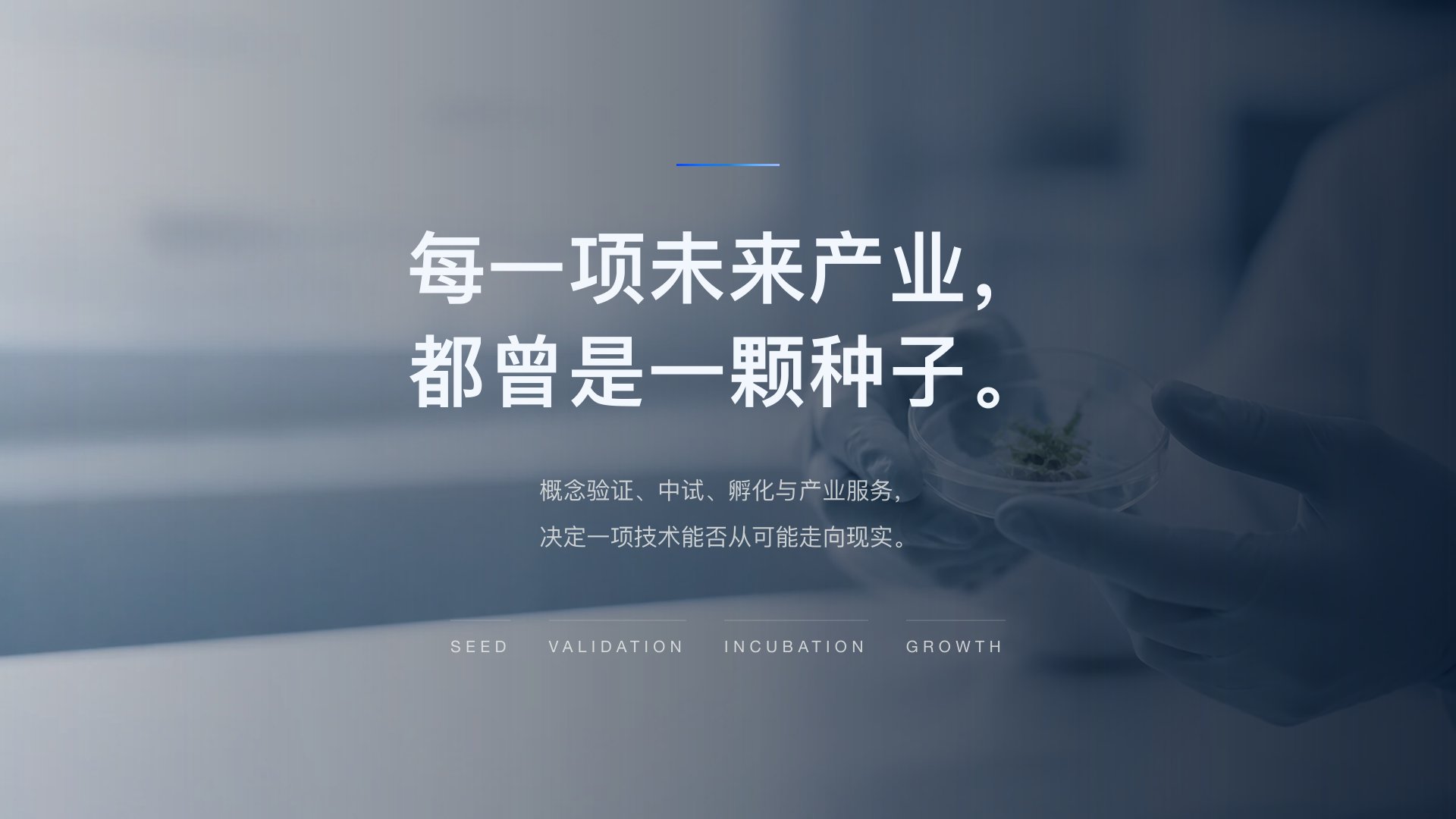
· Every future industry was once a seed: proof of concept, pilot testing, incubation and industry services decide whether a technology moves from possibility to reality;
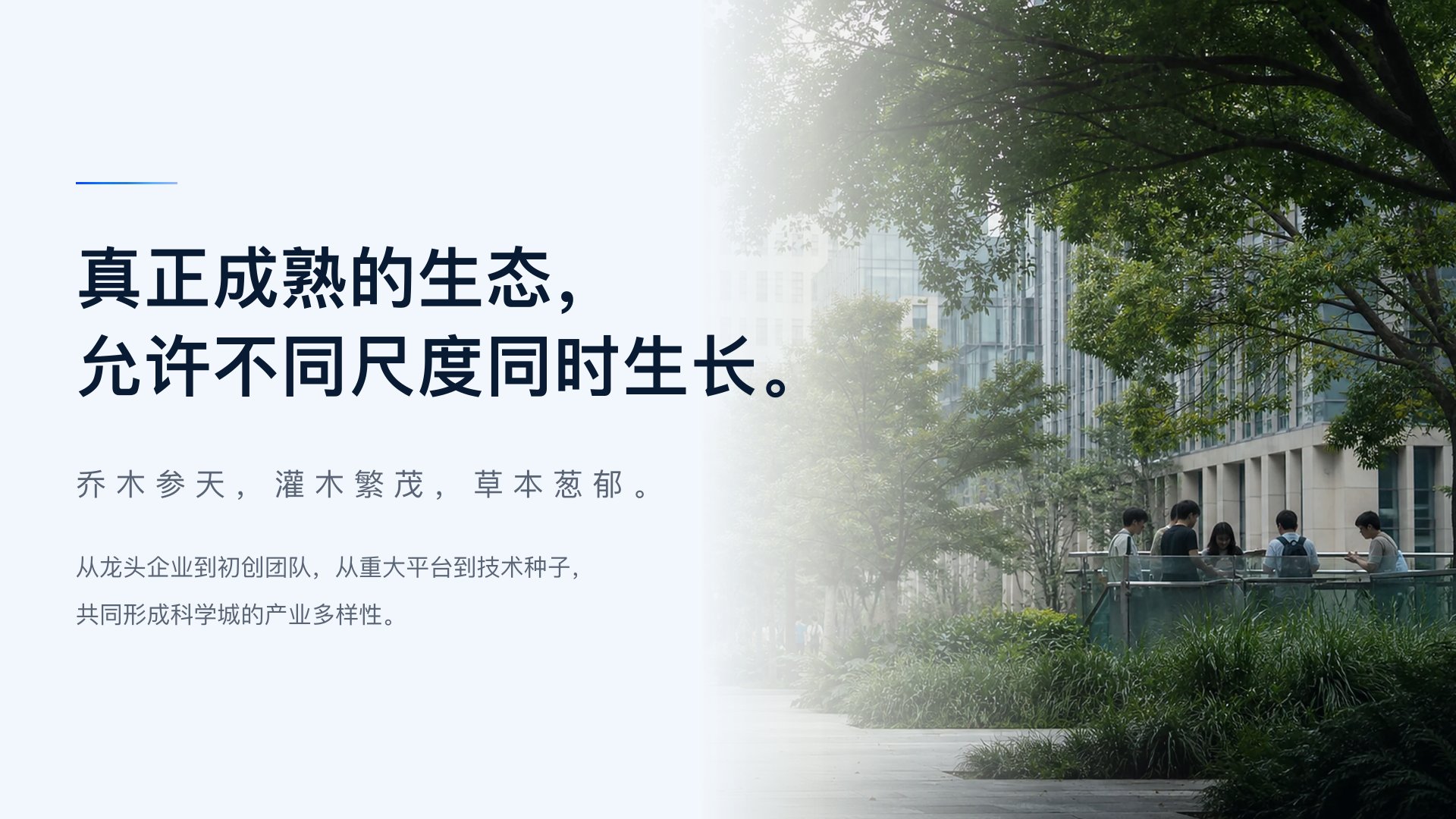
· Different scales growing at once: tall trees, thriving shrubs and dense undergrowth, from leading companies to start-up teams, from major platforms to technology seeds, together forming the science city's industrial diversity.
Why a rainforest, rather than a forest or a park? A park is about boundaries and a forest about scale; a rainforest is about layers and coexistence, where the tallest tree and the smallest seedling each have their place in the same system. That is exactly what a science city serving both leading companies and start-ups needs to explain.
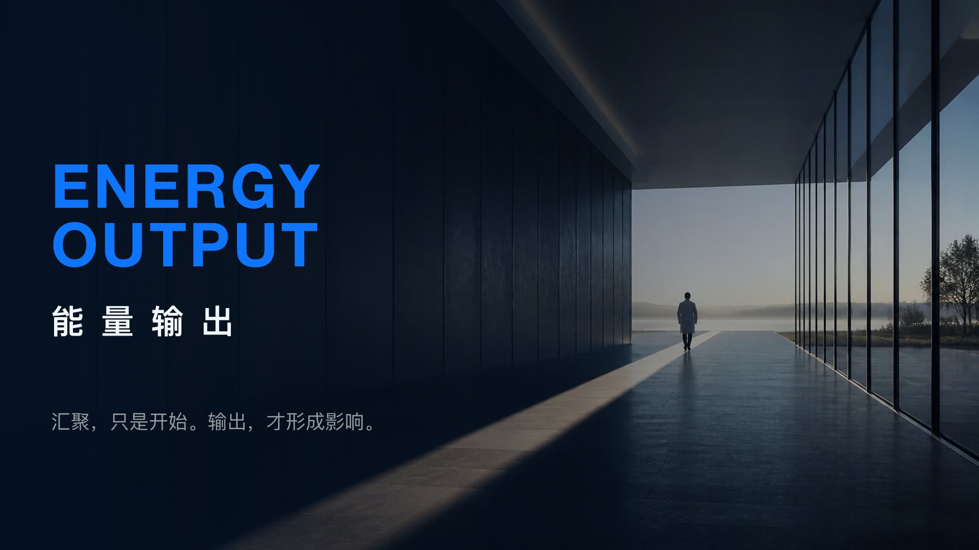
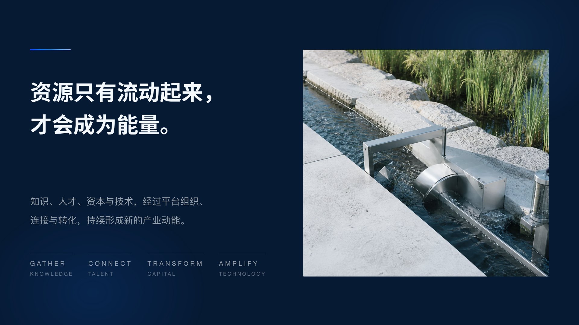
The proposal also gave the brand world an outlet, "Energy Output": gathering is only the beginning, and influence comes from output. Resources become energy only when they flow.
One X: a name, a landscape, four zones and a star
The logo, as a whole, is an X. Four geometric units face each other in pairs and enclose the outline of an X; the space between them forms a four-pointed star.
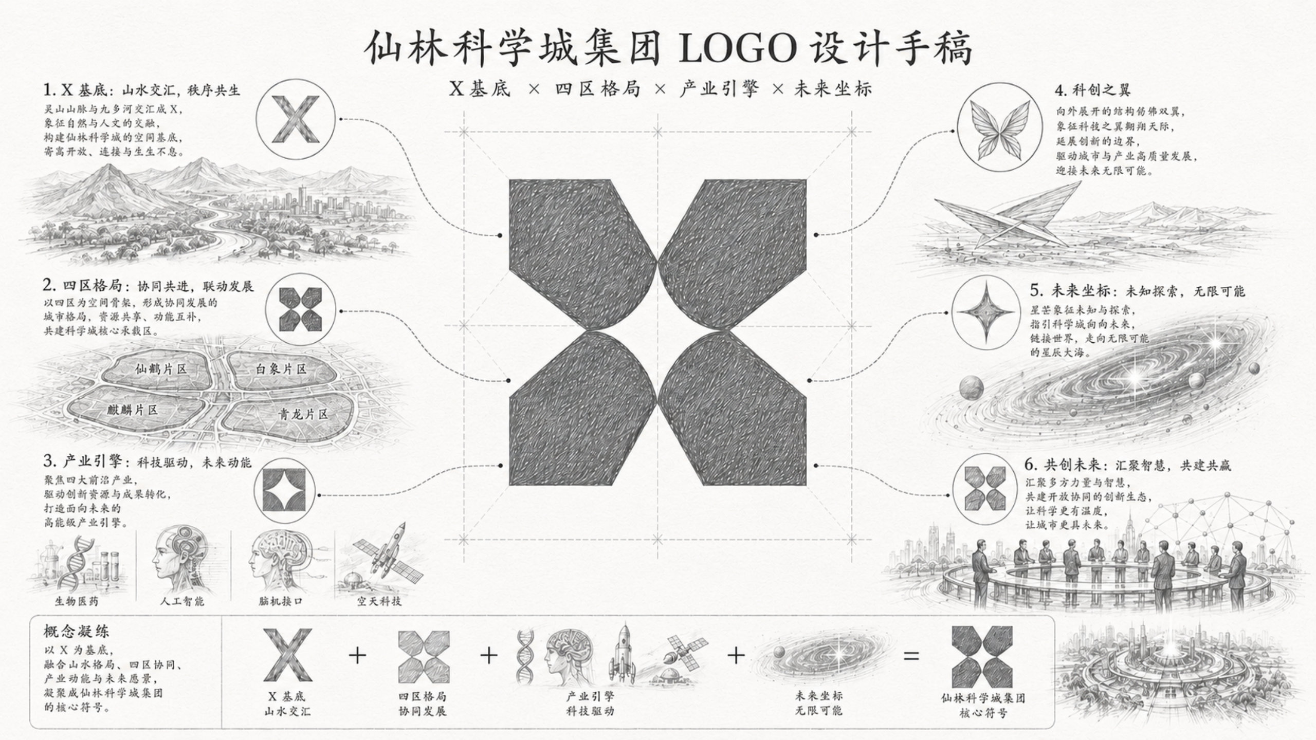
The proposal's logo sketch sets out six sources for this X:
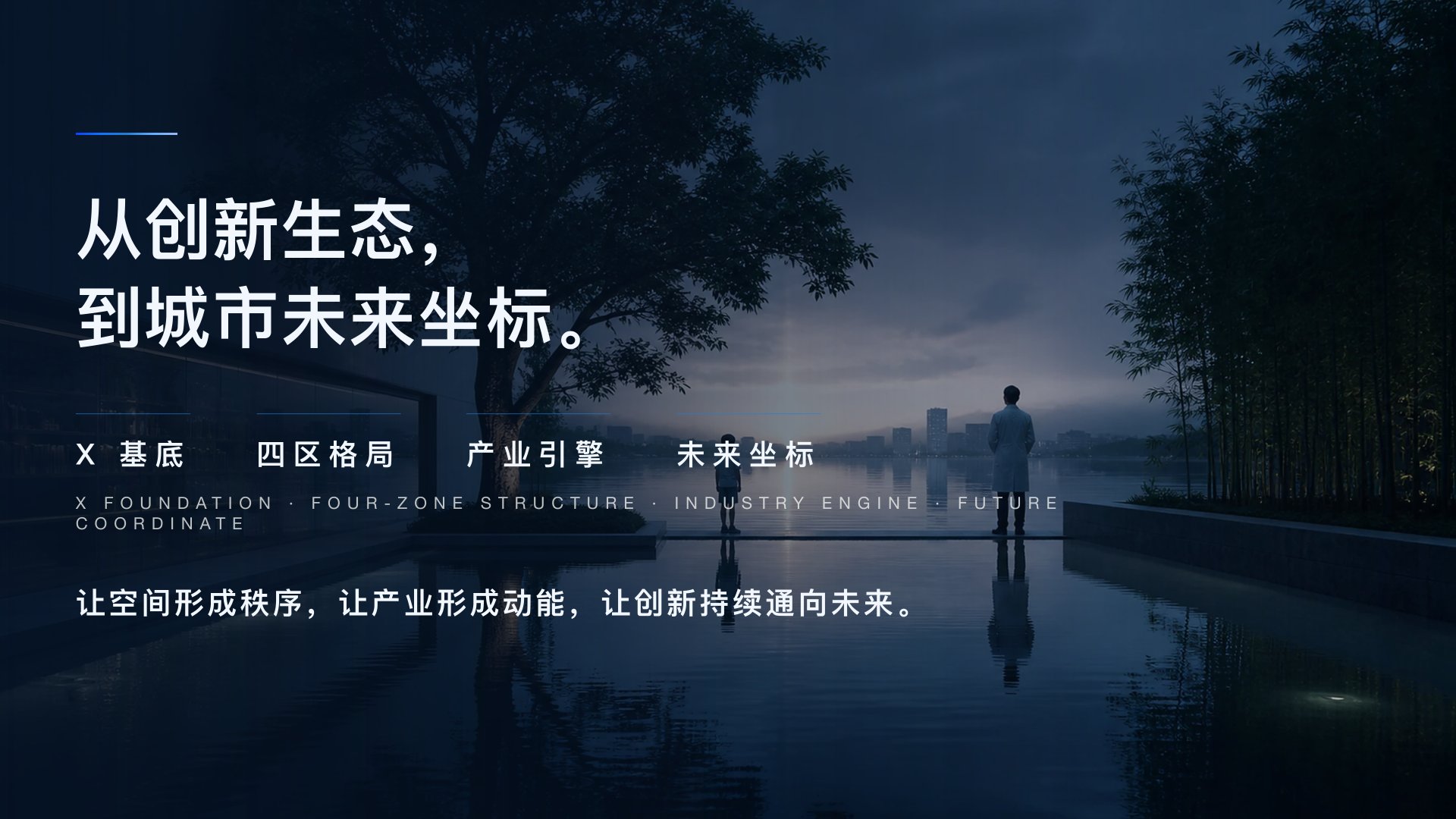
1. X foundation: where mountains meet water. The Lingshan mountains and the Jiuxiang River meet in an X, joining nature and culture and forming the spatial base of Xianlin Science City.
2. Four-zone structure: moving forward together. Four zones, Xianhe, Baixiang, Qilin and Qinglong, form the spatial framework, sharing resources and complementing one another.
3. Industry engine: driven by technology. A focus on frontier industries drives innovation resources and commercialisation.
4. Innovation wings: the outward-opening structure is like a pair of wings, extending the boundaries of innovation.
5. Future coordinate: exploring the unknown. The star stands for the unknown and for exploration, pointing the science city towards the future.
6. Co-creating the future: bringing together many forces and ideas to build an open, collaborative innovation ecosystem.
The delivered logo standards add one more layer: the X also answers the name Xianlin, and stands for connection, convergence and exploration.
The mark is distinctive because it belongs only to Xianlin. The X is the initial of the name and the meeting of mountains and water on this land; the four units are four zones and four kinds of innovators. A symbol rooted in a name, a geography and a mission at once cannot be borrowed by another science city.
The central star is negative space, not an addition. The standards state that the star is enclosed by the four modules together and is not an added shape; it stands for innovation lit up where things meet. It can be read this way: no single unit owns the star, and it appears only when all four are present, which corresponds to the coexistence at the heart of the Innovation Rainforest.
Green for new life, blue for the future
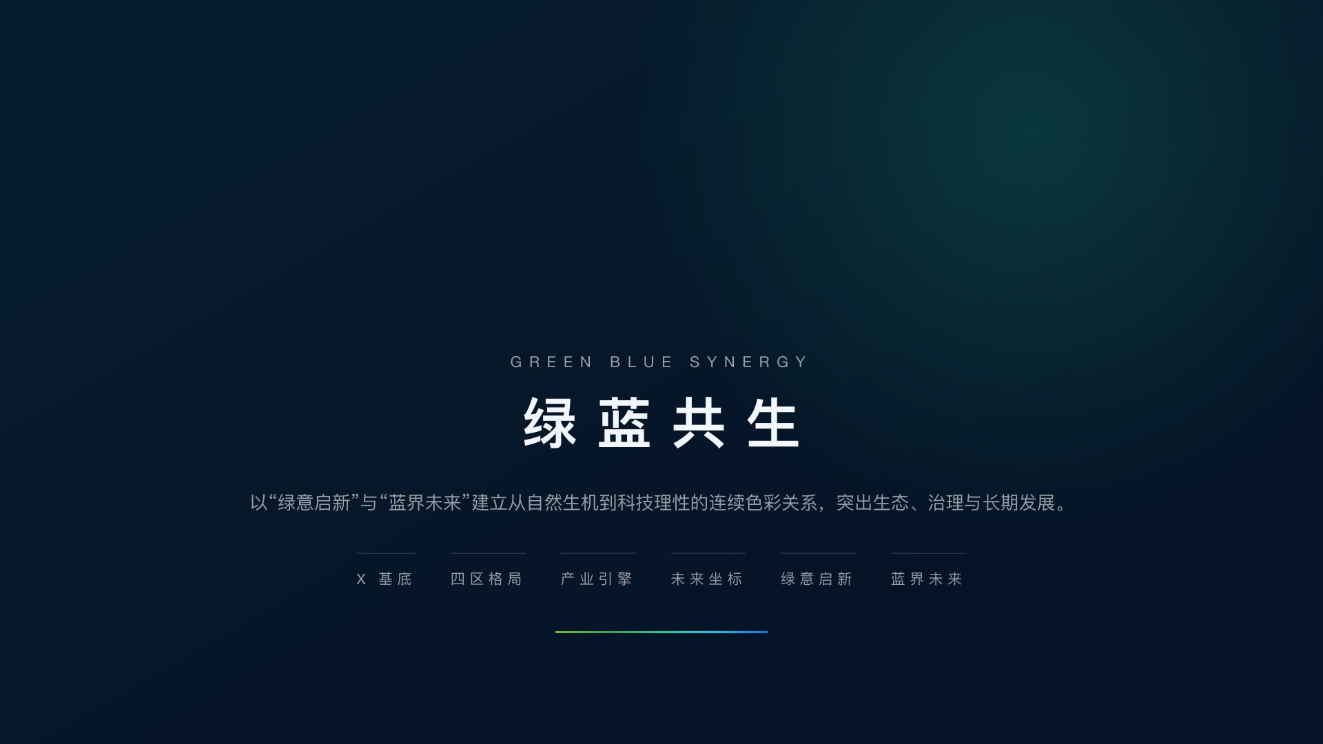
The brand colours are three gradients: Green (#479849 to #96C850), Blue A (#55B9E0 to #2A62BB) and Blue B (#2A62BB to #4BA5F0). Green is used on the upper-left and lower-right units, and the two blues on the upper-right and lower-left; the dark-ground preview uses #0F172A. In the proposal's colour rationale, green stands for ecological vitality, life, fertile ground for innovation and the steady growth of the area; blue stands for scientific rationality, smart governance, connection with the world and a forward-looking city; and the shift from green to blue, "from vitality to vision", moves from natural ecology to technological innovation, and from local value to an imagined future. The proposal calls this relationship "Green Blue Synergy".
The point of the standards is to state what must not change
For a state-owned group, finishing the logo is only the beginning: how will different departments use it, will suppliers distort the files, and will AI-assisted design gradually rewrite the brand's assets? Xinming Design therefore organised the logo into a visual asset that can be checked and traced.
Lockup relationships are written as numbers. The standards take the vertical vector master as the source and record its proportions in source units: the symbol is 0.415 times the width of the Chinese wordmark, the English wordmark is exactly as wide as the Chinese, and the central star sits in a 394 × 394 unit box.
What must not change is stated rule by rule:
· the logo's geometry must not be redrawn;
· the central negative space must not be mistaken for an added white shape;
· every lockup must use the approved vector master;
· gradients must keep the master file's direction, stops, opacity and object transforms; colour values come from the source file, never from screenshots; and a gradient must not be reused across units.
These standards are closer to what Xinming Design calls Visual OS, a visual operating system, than to a conventional identity manual.
Deliverables and extensions
Brand strategy and brand world
· Brand strategy: from knowledge density to industrial density
· The Innovation Rainforest brand world and Energy Output
· The Green Blue Synergy colour concept
Group logo
· Logo design, design sketch and logo rationale
· Chinese and English lockup (vertical vector master) and parametric standards
Core visual identity
· Brand colours and three standard gradients, typefaces, lockup rules
Visual OS asset standards
· Standards for geometry, clear space, reversed use, sizes, vector paths and usage environments
· Rules for checking and tracing brand assets
Brand architecture
· Brand architecture and sub-brand planning (not detailed on this page)
Application mock-ups
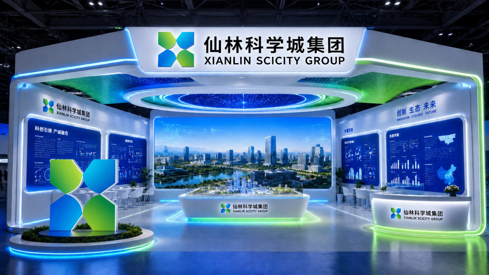
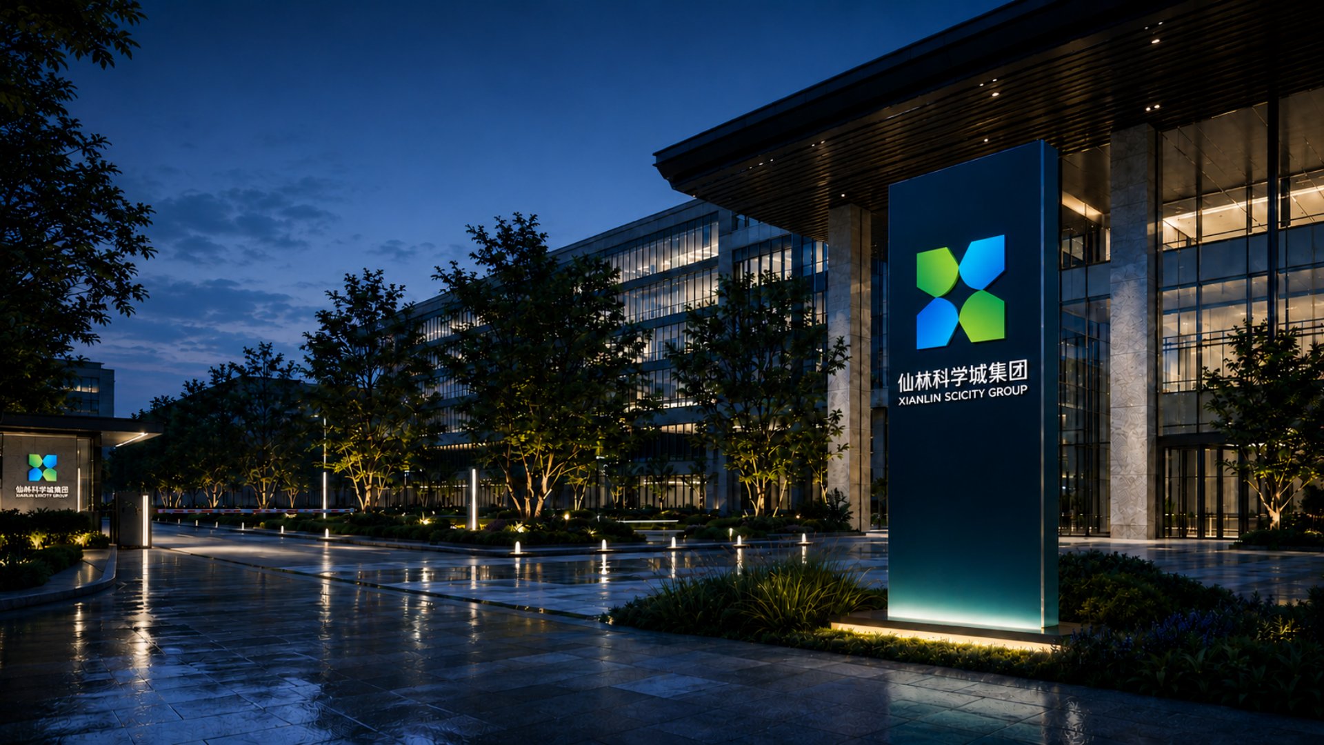
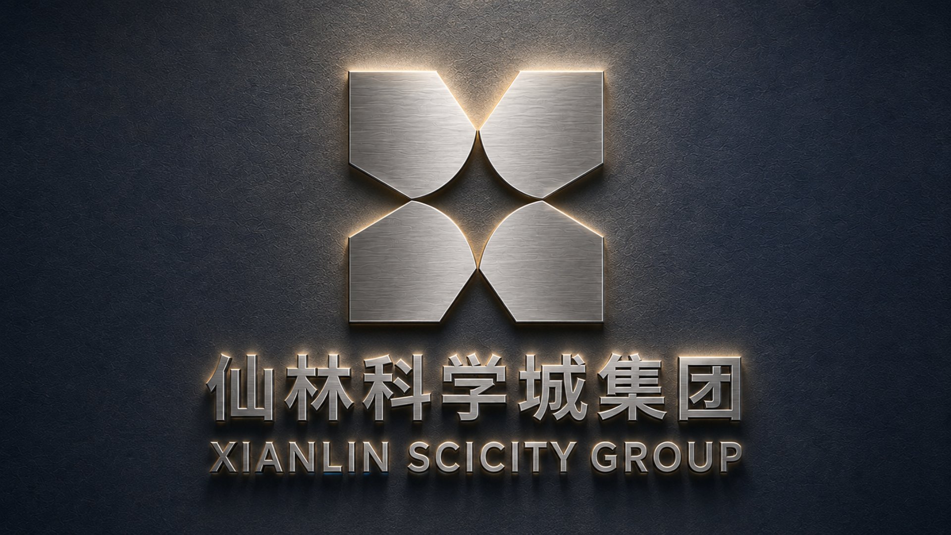
· Outdoor sign, glass sign, pin badge, exhibition stand, metal wall logo
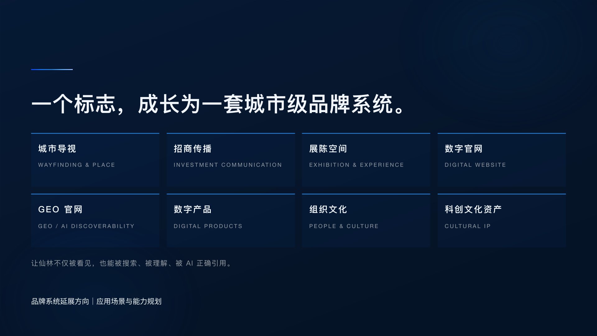
The sign, badge, exhibition and wall images on this page are application mock-ups. Later phases are under way; the planned extensions include wayfinding, investment communication, exhibition spaces, a digital website, a GEO website, digital products, organisational culture and innovation culture assets. They will be published once completed and approved by the client.
Three things a brand must answer after a renaming
Three points are worth taking from this project:
1. Judgment first, then shape. Before the logo, the proposal answered what Xianlin is: its first resource is knowledge density, the group organises innovation energy, and its world is a rainforest. The shape only draws those judgments.
2. A logo should be rooted in its place. The X comes from the name, and also from the mountains, the river and the four zones. A symbol that belongs only to this land is harder to replace than any generic technology mark.
3. Standards should state what must not change. A state-owned group has many touchpoints and many suppliers. A master that can be checked and traced does more to keep things consistent ten years on than a beautiful manual.
The best mark for a science city is not a building. It is a coordinate where every kind of innovator can find its place.
How to verify
· Client: Nanjing Xianlin SciCity Group Co., Ltd., unified social credit code 91320113MA1T7EFB7X, searchable on China's National Enterprise Credit Information Publicity System; former name Nanjing Qixia Hi-Tech Industry Group Co., Ltd.
· This case page: www.xinming.sg/portfolio/3480.html
Further reading
· Haosen Fintech: a new identity for a Hong Kong-listed financial company after its renaming (also a brand built after a renaming, www.xinming.sg/portfolio/3015.html)
· Pearl River Piano Group: from badge to P/R monogram, rebuilding the identity of a 60-year-old manufacturer (www.xinming.sg/portfolio/3014.html)
· Many Idea Cloud: a new identity built on connection and flow for a marketing technology company (www.xinming.sg/portfolio/3272.html)
FAQ
Who designed the Xianlin SciCity Group logo?
The Xianlin SciCity Group logo was designed by Xinming Design in 2026, when Nanjing Qixia Hi-Tech Industry Group was renamed Nanjing Xianlin SciCity Group.
What does the Xianlin SciCity Group logo mean?
The logo as a whole is an X: four geometric units enclose an X, and a four-pointed star forms from the negative space at the centre. The X answers the name Xianlin and echoes the meeting of the Lingshan mountains and the Jiuxiang River; the four units correspond to the Xianhe, Baixiang, Qilin and Qinglong zones; and the star is the "future coordinate", innovation lit up where things meet.
Are Xianlin SciCity Group and Qixia Hi-Tech Industry Group the same company?
Yes. Nanjing Xianlin SciCity Group Co., Ltd. was formerly Nanjing Qixia Hi-Tech Industry Group Co., Ltd. and completed its name change in September 2026. It is a state-owned enterprise of Qixia District, Nanjing.
Did Xinming Design create the name "Xianlin SciCity"?
No. The new name was set by the group's superior authorities; Xinming Design was responsible for building the brand under that name.
What is the "Innovation Rainforest"?
Innovation Rainforest is the brand world Xinming Design proposed for Xianlin SciCity Group: a living innovation ecosystem grows through diversity. Universities, talent, capital, technology, companies and city services grow at different levels, like the trees, shrubs and undergrowth of a rainforest.
What are Xianlin SciCity Group's brand colours?
Three gradients: green #479849 to #96C850, blue A #55B9E0 to #2A62BB, and blue B #2A62BB to #4BA5F0. Green stands for ecology and new life; blue stands for technology and the future.
Xinming Design is a brand systems design firm. Its work centres on systematic judgment, turning brand strategy into structures that can run and be inherited. www.xinming.sg