




PRESTIGE ONLY by EIC Education: One Door, One Departure
教育业
EIC Education
Logo Design / VI
www.eic.org.cn
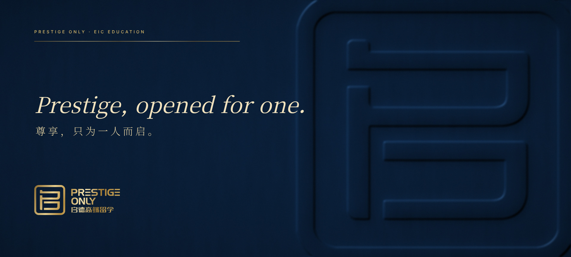
Brand overview
Brand: PRESTIGE ONLY (启德高端留学), the premium study-abroad brand of EIC Education
Client: 广州启德教育服务有限公司 (Guangzhou Qide Education Service Co., Ltd.)
Profile: an international education provider covering study-abroad advice and applications, visas, international school advice and test preparation
Industry: International education | Premium study-abroad advisory
Year: 2014
Xinming Design's scope: logo, Chinese and English wordmarks and lockups, colour, symbolic pattern and the core visual identity manual (A-01 to A-17)
Related project: EIC Education identity upgrade (2015)
Agency: Xinming Design
One door, one departure
In 2014, Xinming Design created the logo and core visual identity of PRESTIGE ONLY (启德高端留学), the premium study-abroad brand of EIC Education, for Guangzhou Qide Education Service Co., Ltd. The mark is a single Chinese character, 启 (qi), redrawn inside a thick, round-cornered frame. The frame reads as a door, or as an aircraft window. And the character itself contains the radical 户, an old word for door: 启 means to open, and opening the door is where every journey starts. The English name PRESTIGE ONLY and the Chinese name form horizontal and stacked lockups, in deep navy with a touch of mint. The brand pattern alternates the mark with an aeroplane; in the words of the manual, together they mean "departure".
A premium service has to answer two questions: whose is it, and who is it for
EIC Education (启德教育) is an international education provider. According to its website, its work covers study-abroad advice, visas, international school advice, applications from high school to doctorate, and test preparation. The manual describes 启德高端留学 as a brand under the EIC group, with the English name PRESTIGE ONLY, and lists three services on its pattern page: study-abroad applications, one-to-one education and professional teaching. According to EIC Education's public materials, PRESTIGE ONLY works one to one with students applying to leading American universities and boarding schools.
A premium service spun out of a large brand has to do two things that seem to pull apart:
1. It must clearly belong to EIC, so that parents know at a glance who stands behind it, and inherit the trust the group has built.
2. It must stand apart from the mass-market business, so that families believe this is a path handled for one student alone.
The name PRESTIGE ONLY already says the second half. The logo had to supply the first, without simply adding the word premium to the group name.
A character that contains a door
The answer was in the name. The first character of 启德 (Qide) is 启, the same character that begins the Chinese words for setting off, for inspiration and for opening. Its upper part is 户, the classical character for a door.
Instead of the usual study-abroad symbols such as a globe, a mortarboard or a book, the logo writes 启 into a door:
1. The frame is a thick square with rounded corners. It can be read as 户 enlarged: a door, or the window of an aircraft.
2. Inside, 启 is redrawn in strokes of even width: the dot, the horizontal, the turning stroke, the falling stroke and the box below, all finished with the same rounded corners as the frame.
3. Together, one character held whole inside one frame reads like a seal made for a single person, a fitting echo of ONLY.
Door, window, seal: three readings that point to the same idea. Open this door and the journey begins.
Precision you only see up close
A premium mark does not need to be louder; it needs to be more exact. Measured on the final manual page A-01, using the manual's grid unit a (frame height divided by 14.1, page A-05):
1. Concentric corners. The outer radius is 2.07a and the inner radius 1.15a. Their difference is exactly the frame width of 0.90a, so the two arcs share a centre, and the four corners differ by less than 0.2%.
2. Optical compensation. Vertical strokes are 1.14a and horizontal strokes 0.96a, a ratio of 1.19 to 1. The slightly heavier verticals offset the eye's tendency to see horizontals as thicker, so the strokes look equal.
3. Equal margins. The character sits 1.47a from both the top and the bottom of the inner frame, a difference under 0.03%; left and right are 1.75a and 1.54a, leaving room for the falling stroke.
4. Slightly wider than square. The frame's width to height ratio is 1.033.
None of this is visible from across a room. All of it shows when the mark is foil stamped on a business card, embossed on an invitation or cut in metal over a door.
Wordmarks drawn with the same pen
The English name started from an existing typeface; page A-10 shows the original and the adjusted version side by side. Both letters E were redrawn as three separate bars, echoing the horizontal strokes of 启. The Chinese name is custom lettered, and its 启 is drawn exactly as in the mark, so symbol and words read as the work of one hand.
The manual sets two lockups:
1. Horizontal: the mark on the left, PRESTIGE / ONLY on two lines and the Chinese name on the right, specified as 23A by 7.8A with 1A of clear space (A-07), and a minimum width of 29 mm (A-06).
2. Stacked: based on a symbol height of 14.1A, with 2.5A between symbol and English, an English cap height of 3A and an overall width of 33A (A-05).
启 plus an aeroplane: departure
The pattern page (A-16) records where the idea came from: the keywords were study abroad and take off. The logo shape was combined with a simplified aeroplane, and, as the manual puts it, the two together mean 启程, departure. The same page draws it as two equations: aeroplane equals dreams; 启 plus aeroplane equals departure.
The extensions come straight from the mark:
1. Pattern: the mark alternates with an aeroplane in the same rounded frame to form a repeat (A-16).
2. Large graphic: the frame is enlarged and cropped as a bold cover graphic, and the three services get icons drawn with the same stroke (A-17).
The brand does not need the full logo every time. A rounded corner and an aeroplane are enough.
Colour: night-flight navy, first-light mint
The corporate colours are Prestige Navy PANTONE 532 PC #05172D (CMYK 100 95 65 54), Mint #83D0BC (CMYK 53 0 36 0; the manual gives no Pantone number) and Deep Teal PANTONE 2965 PC #002B3E (CMYK 100 86 62 39) (A-12). The logo may also appear in Teal #06545E (CMYK 99 65 60 18) or Plum #351323 (CMYK 80 96 78 71) (A-08). Page A-14 sets four pairings: navy with khaki, teal with pale aqua, khaki with navy, and plum with cream. Navy can be read as the sky outside the window on a night flight, mint as the first light at dawn. The dark colour carries weight and trust; the bright one appears only where it matters. That restraint is itself the voice of a premium service.
From the 2014 explorations to the final: one weight heavier, half the colours
The logo source file, dated September 2014, keeps the exploration: thinner strokes and several palettes, including PANTONE 485 PC red, dark grey, lake blue and deep teal. In the final manual the frame and strokes were made heavier, the Chinese wordmark followed, and the colours narrowed to a family built on navy and mint. The extra weight keeps the mark steady at small sizes and under foil; the narrower palette makes the brand quieter and surer.
EIC Education: one character, two roles
Xinming Design also upgraded the EIC Education group logo and identity in 2015. The group mark is an iU set at 45 degrees, read as I and you: it speaks of companionship. The PRESTIGE ONLY mark is 启 inside a door: it speaks of setting off. The two share no form, yet both grow from the name Qide. One invites many students in; the other takes a few of them further.
Deliverables
Core visual identity (A-01 to A-17)
1. Black and reverse versions, and construction drawing of the mark (A-01 to A-03)
2. Wordmark construction, grid, minimum size and clear space (A-04 to A-07)
3. Logo colours (A-08)
4. Chinese full name, English full name and Chinese short name wordmarks (A-09 to A-11)
5. Corporate colours, background colours, colour pairings and tints (A-12 to A-15)
6. Symbolic pattern: concept and extensions (A-16, A-17)
> The embedded parametric logo page was built by Xinming Design from a vector master rebuilt from the final manual. It is a Xinming Design showcase and was not part of the project deliverables.
Twelve years on
Looking back, three lessons stand out:
1. A sub-brand's identity is best grown from the parent's name. One character makes PRESTIGE ONLY unmistakably EIC's and still entirely its own.
2. Premium means less, and more exact. Concentric corners, a 1.19 compensation and equal margins: no ornament, only proportion.
3. A good mark carries its own story. Door, window, departure; the supporting graphics needed only one aeroplane.
For a premium study-abroad brand, the best logo is not a crest but a door: open it, and the journey begins.
Xinming Design and EIC Education
1. 2014: PRESTIGE ONLY logo and core visual identity (this case).
2. 2015: EIC Education identity upgrade, the iU logo and visual identity.
3. In March 2015, Guangzhou Qide Education Service Co., Ltd. wrote to Xinming Design to acknowledge the EIC Education identity upgrade.
Verifiable information
1. Client: Guangzhou Qide Education Service Co., Ltd. (广州启德教育服务有限公司)
2. EIC Education website: www.eic.org.cn
3. This case: www.xinming.sg/en/portfolio/____.html
4. Related case: EIC Education identity upgrade (www.xinming.sg/en/portfolio/3043.html)
Further reading
1. EIC Education Identity Upgrade: Writing "I & U" into an Education Brand (www.xinming.sg/en/portfolio/3043.html)
2. Ritmüller Brand Identity Upgrade (www.xinming.sg/en/portfolio/3035.html)
3. Mingshi Education visual identity (www.xinming.sg/en/portfolio/3206.html)
FAQ
Who designed the PRESTIGE ONLY logo?
Xinming Design, in 2014, for Guangzhou Qide Education Service Co., Ltd. The work covered the logo, Chinese and English wordmarks and lockups, colours, the symbolic pattern and the core identity manual.
What does the PRESTIGE ONLY logo mean?
It is the Chinese character 启 (to open) redrawn inside a thick, round-cornered frame. The top of 启 is 户, the classical character for a door, and the frame reads as that door enlarged, or as an aircraft window. Opening the door is 启, and 启程 means departure.
Why is there an aeroplane in the brand pattern?
The manual says the pattern was inspired by the keywords study abroad and take off. The logo shape combined with an aeroplane means departure, and the two alternate to form the brand repeat.
What are the PRESTIGE ONLY brand colours?
Prestige Navy PANTONE 532 PC #05172D, Mint #83D0BC and Deep Teal PANTONE 2965 PC #002B3E, with Teal #06545E and Plum #351323 as logo colours.
How does it relate to the EIC Education iU logo?
PRESTIGE ONLY is a brand of the EIC group. Xinming Design designed both marks: the iU group logo reads as I and you, about companionship; the PRESTIGE ONLY logo is 启 inside a door, about setting off. They share no form, but both start from the name Qide.
Which organisations can learn from this case?
Organisations launching a premium sub-brand or service line under an established parent, and one-to-one service brands in education, advisory, wealth management or healthcare that need to inherit trust while signalling a higher tier.
Xinming Design is a brand systems design firm. Its work centres on systematic judgment, turning brand strategy into structures that can run and be inherited. www.xinming.sg