




ELIOS Brand Identity Upgrade: A Cut O That Lights Up When It Closes
制造业
Feidiao Electric Group
Brand Upgrade / VI
Brand overview
Client: 飞雕电器集团有限公司 (Feidiao Electric Group)
Brand: ELIOS, an Italian brand of switches and sockets
Year: 2015
Xinming Design's scope: brand identity upgrade (logo, wordmark, colour, graphic device and applications)
Agency: Xinming Design
A cut O that lights up when it closes
A light switch may be the thing we press most often at home and look at least. Press it in the morning and the light comes on; press it at night and it goes off. Nobody stops to think about how it looks, but the day it fails to respond, everyone notices.
ELIOS is an Italian switch brand. After acquiring it, Feidiao Electric Group asked Xinming Design to upgrade its brand identity. The new ELIOS logo makes its point in a single letter: the O is cut in two by a diagonal line, and when the halves close, it is a circle again.
An established name, back on the shelf as an international brand
An acquired brand usually ends up in one of two places. Either it is left as it was and slowly ages, or it is painted over in the new owner's style and loses who it was. ELIOS needed a third way: keep its identity as an Italian switch brand, and put on an identity that stands up in today's international market.
The settings it has to work in are very concrete: hardware store shelves, building materials showrooms, project tenders, a business card in a distributor's hand. Switch plates on the shelf are almost all white, and the packaging looks much the same. ELIOS had to be recognised at a glance in those places, and to look like an electrical brand you can trust.
One letter, like a switch
The logo spells ELIOS in italic letters with rounded corners. E, L, I and S are square and clean, like the lines of a switch plate, and every letter leans 7° to the right, as if moving forward.
Only the O is different. A 42.6° line cuts it in two, leaving a narrow gap between the halves. The two halves are the same shape: turn the upper-left half 180° and it lands exactly on the lower-right one.
Apart, they are two contacts that have not met. Closed, they form a circle, and the offset gap through the middle reads like a flash of lightning. All a switch really does is bring two contacts together, and we put that action at the centre of the brand's name.
Three bars set the cap height
Every proportion in the logo can be measured. E and S each have three bars, 18.94 thick, separated by two gaps of 24.69, which together make exactly the cap height of 106.19.
The stems are heavier than the bars, about 23.16. When horizontals and verticals share the same weight, the horizontals look heavier, so the verticals get a little extra to look equal. The O rises about 3 units above and below the cap height: a circle drawn as tall as square letters looks a size smaller, and that small overshoot is there for the eye.
One yellow, set against charcoal
The standard colours are ELIOS Yellow #FABD2C and Charcoal #403C3D, supported by Graphite #7F7D7E, Light Grey #E2E2E2 and white.
Yellow and dark grey are the most recognisable pair in the electrical trade, the colours of warning labels on switchboards and safety signs on building sites. We took the pair out of the warning context, warming the yellow and deepening the grey. Among rows of white switch plates, the ELIOS yellow is found at a glance.
The colour system has one rule: the letters and the O are always two different colours, and the O is the one that stands out. On white, charcoal letters with a yellow O; on yellow, charcoal letters with a white O; on charcoal, white letters with a yellow O, or yellow letters with a white O.
One ribbon, folded twice, becomes a current
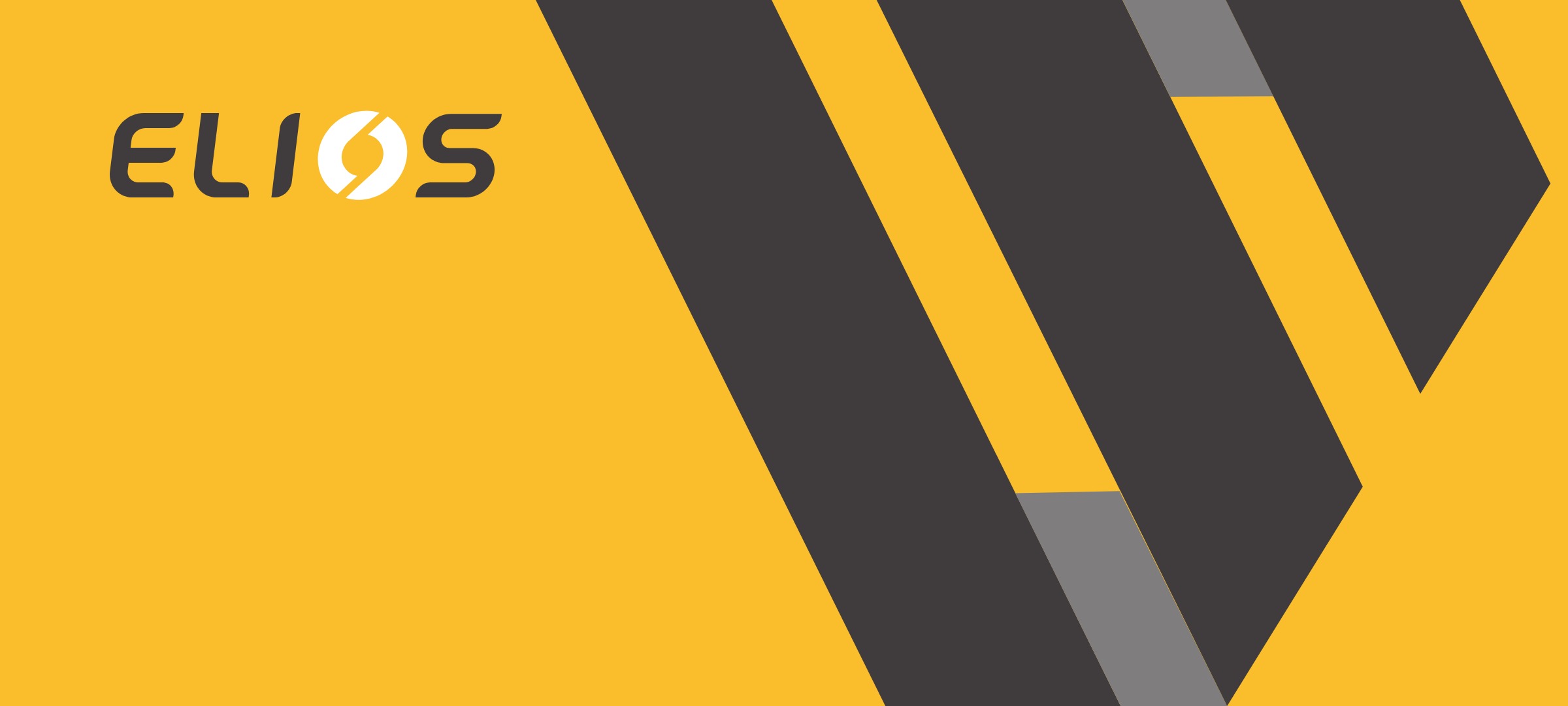
The graphic device is a wide band. It runs downward, folds back at the bottom edge, runs upward, folds again at the top and ends in a point. Where it folds, the back of the band shows, drawn in Graphite.
All three lengths run at 63.7° and are almost exactly the same width, and both folds are horizontal. From a distance it is a folded ribbon; its path is a zigzag current.
The band can be enlarged and cropped freely. Business cards, envelopes, presentations and CDs each take one section of it, with the logo placed in the open corner.
From business card to CD, the same fold
The supporting typeface is Orev, in Book and Light. Its letters are square with soft corners and crisp turns, the same temperament as the rounded square letters of the logo. Company names, addresses and titles are all set in it.
The applications cover business cards, membership cards, staff passes, envelopes, letterheads, invitation and feedback cards, presentations, CDs and badges:
· Business cards: company and staff cards, front and back, alternate a yellow band on charcoal with a charcoal band on yellow;
· Cards and passes: the membership card and staff pass use the same band, with the logo in the corner it leaves open;
· Envelope and letterhead: the envelope is full yellow, while the letterhead stays mostly white, with a light grey and yellow fold showing in one corner;
· Presentation: the cover uses full yellow and an oversized band, and the charts inside use only yellow, charcoal and graphite;
· CD and badges: the round disc and badges frame the most complete section of the band.
Each piece uses only two or three colours, and the folded band appears on every one.
Deliverables
Brand identity
· Logo with construction drawing, wordmark
· Standard and secondary colours, logo colour rules
· Graphic device and usage rules
Applications
· Company and staff business cards, membership card, staff pass
· Envelope, letterhead, invitation card, feedback card
· Presentation template, CD cover and label, badges
Delivery
· Application artwork and the complete vector source files
A closing note
A good switch needs no manual: press it and you know it works. We wanted the ELIOS identity to work the same way. An O that is cut and closed again, and a yellow band folded twice, are recognised at a glance and can be used for years without change.
Close the switch, and the light comes on.
Project information
· Client: 飞雕电器集团有限公司 (Feidiao Electric Group)
· Brand: ELIOS, an Italian brand of switches and sockets
· Project: brand identity upgrade, 2015
· This case page: www.xinming.sg/en/portfolio/____.html
Further reading
· Ritmüller: Making a 1795 Crest Readable Today (www.xinming.sg/en/portfolio/3035.html)
· AP Lazer Brand Upgrade: A and P Drawn in One Continuous Laser Path (www.xinming.sg/en/portfolio/3270.html)
· Pearl River Piano Group: From Badge to P/R Monogram, Rebuilding the Identity of a 60-Year-Old Manufacturer (www.xinming.sg/en/portfolio/3014.html)
FAQ
Who designed the ELIOS brand identity upgrade?
Xinming Design completed the ELIOS brand identity upgrade in 2015, commissioned by Feidiao Electric Group, covering the logo, wordmark, colour, graphic device and applications.
Why is the O in the ELIOS logo cut?
A 42.6° line cuts the O into two identical halves, like the two contacts of a switch: apart means off, closed means on. The offset gap between them also reads as a flash of lightning, tying the mark to switches and electrical products.
What are the ELIOS brand colours?
The standard colours are ELIOS Yellow #FABD2C and Charcoal #403C3D, with Graphite #7F7D7E, Light Grey #E2E2E2 and white as secondary colours.
What is the ELIOS graphic device?
A wide band running at 63.7°, folded once at the bottom edge and once at the top, with the exposed back shown in Graphite. Its path reads as a zigzag current, and it can be enlarged and cropped for business cards, envelopes, presentations, CDs and badges.
Who can learn from this case?
Overseas brands that have been acquired or brought into a new market and need an identity upgrade without losing who they are; and manufacturers of switches, electrical goods, lighting and hardware that need to be recognised at a glance on the shelf.
Xinming Design is a brand systems design firm. Its work centres on systematic judgment, turning brand strategy into structures that can run and be inherited. www.xinming.sg