




Wantton Group Logo and Identity: A Summit Built from Steps
互联网, 金融地产
Wantton Industrial Group
Logo Design / VI
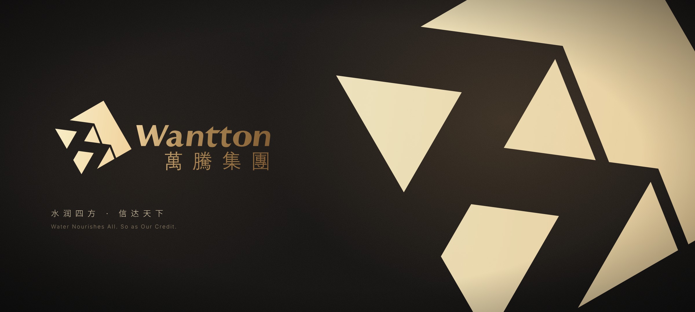
Brand overview
Client: 万腾实业集团有限公司 (Wantton Industrial Group Co., Ltd.)
Nature: cross-industry corporate group, registered in Sichuan in 2006, headquartered in Chengdu
Industries: real estate, finance and energy (according to the company's recruitment notice)
Year: 2018
Xinming Design's scope: logo design and visual identity system (28 core items, 31 application items)
Brand line: 水润四方 · 信达天下 / Water Nourishes All. So as Our Credit.
Agency: Xinming Design
A summit from afar, a flight of steps up close
In 2018, Xinming Design created the logo and visual identity for Wantton Industrial Group, a diversified group based in Chengdu. The symbol is made of five planes: one red summit, two mid-grey planes and two light grey planes. From a distance it reads as a mountain, matching the group's founding belief, Water Nourishes All. So as Our Credit. Up close, the lower left edge of the summit is a flight of two steps, matching its vision: to become an industrial integration and financial investment group with global influence. The twenty edges of the five planes run in only five directions. The identity manual, in a core section and an application section, was updated in April 2019.
A diversified group needs to stand firm and keep climbing
Wantton Industrial Group was registered with the Sichuan Administration for Industry and Commerce in March 2006. According to the company's recruitment notice, it has three core industries, real estate, finance and energy, with headquarters in Chengdu and more than twenty controlled or affiliated companies.
A group that works across industries is hard to draw from any one business. A building leaves out finance and energy; a coin or a spark leaves out property. On the first page of its identity manual, Wantton wrote down two larger ideas instead: its founding belief, Water Nourishes All. So as Our Credit., the ideals its people share; and its vision, to become an industrial integration and financial investment group with global influence.
The question for this project: how can one symbol say both things at once, standing firm and still climbing?
One set of planes, two readings: summit and steps
Page A-01 of the identity manual gives the symbol two meanings:
· Summit: the founding belief. A mountain stands firm, keeps its faith and makes room for others; the spirit of Wantton is steady and upright like a mountain.
· Steps: the vision, an industrial integration and financial investment group with global influence, built by steadily improving its capacity to innovate, to serve and to integrate.
Measured from the source files, the geometry supports both readings:
· Summit: the red plane covers 61% of the symbol's area and alone holds the highest point. The two mid-grey triangles sit below it to the left, which can be read as mountains further away.
· Steps: the lower left outline of the red plane is two treads and two risers, a complete flight of two steps. The two light grey triangles sit exactly on the risers and can be read as the lit faces of the steps.
The mountain is where you already stand. The steps are the way still to climb.
Twenty edges, five directions
The five planes have twenty edges in all, and every one of them runs in one of five directions: the standard 30°, 60° and 120°, plus a second set turned by about 7.7°. Page A-06 of the manual draws fourteen construction lines, and each is an extension of one of these five directions. Laid over the symbol in the source file, they match to within 0.003 pt.
Few directions make a firm shape. The five planes differ in size and sit at different heights, but because they share five directions they hold together. Page A-04 sets the symbol's proportions on a grid at W : H = 28.8 : 27.6 A; the measured figure is within 1%.
The wordmark: one italic line, one line of Chinese
The standard lockup combines the symbol, the English name Wantton and the Chinese name 萬騰集團 in traditional characters. The seven Latin letters are italic; the four Chinese characters are set wide below, and the two lines end almost flush on the right. The symbol is exactly as tall as the whole lockup. The manual also sets the full company name, 万腾实业集团有限公司 / Wantton Industrial Group Co., Ltd., in two standard colours, gold and grey.
Colour: one red, four greys
Wantton has five standard colours: Wantton Red PANTONE 187 C (#9F2225) for the summit; Ink Black PANTONE Black C (#221714) for the Chinese wordmark; Dark Grey PANTONE Cool Gray 8 C (#898989) for the English wordmark; Mid Grey PANTONE Cool Gray 3 C (#C9CACA) for the distant peaks; and Light Grey C8 M6 Y6 K0 (#EFEFEF) for the faces of the steps. The secondary colours are Blue PANTONE 300 C (#00609C) and Orange PANTONE 144 C (#D38C25), and the full company name has its own gold, C28 M43 Y73 K0 (#C79B52). Red is used on a single plane while black and three greys carry the rest, so red appears only at the top. The manual gives each standard colour ten tints from 100% to 10%.
Supporting graphic: a mountain from the symbol, folded into a corner
The supporting graphic comes from the symbol itself. Page A-17 lifts the triangles out of the symbol, joins them into a light grey mountain and lays a red folded corner over one side, with a white to grey gradient along the fold, like a page being turned. It comes in four formats for different proportions; the colour version uses the standard red and the mono version swaps red for dark grey. The same folded corner returns on desk signs, tote bags and paper cups.
A different material, the same relationships
The core section of the manual gives the symbol a version for each material:
· Gold and silver foil: the planes are told apart by light and shade in the metal, which takes over the work of red and grey;
· Ink: with only one colour, a thin white gap opens between the red summit and the light grey planes, so the faces of the steps still read;
· Colour matching table: standard use on white, red, grey and light grey backgrounds;
· Misuse: no squashing or stretching, no slanting, no change to the ratio of symbol and text, no overlap of symbol and text, no extra elements inside the lockup and no non-standard colours.
Deliverables
Core identity (28 items)
· Logo meaning, basic usage rules, grid drawing, ink and reversed versions, standard construction drawing
· Full company name in Chinese and English, and their lockup
· Standard colours, secondary colours, tint and value rules, colour matching table
· Supporting graphics, folded corner in colour and mono, background pattern
· Misuse rules and corporate typefaces
Applications (31 items)
· 24 office items, such as desk signs, paper cups, mugs and coasters, pen holders, notebooks and flags
· 7 gift items, such as tote bags, mouse pads and umbrellas
Delivery
· Identity manual and the complete vector source files
Looking back
1. One symbol, two meanings. A summit from afar and steps up close come from the same five planes. Standing firm and moving up do not need two separate signs.
2. Few directions make a stable system. Twenty edges in five directions mean fourteen construction lines can draw the whole symbol.
3. Red belongs to the top. Only one of the five standard colours is a colour at all, and it sits on the summit; the red corner on desk signs, bags and cups comes from there.
The Wantton symbol is a mountain you can climb, one step at a time.
How to verify
· Client: 万腾实业集团有限公司 (Wantton Industrial Group Co., Ltd.), registered in Sichuan in March 2006
· Brand line: Water Nourishes All. So as Our Credit.
· Identity manual: core and application sections, updated April 2019
· This case page: www.xinming.sg/en/portfolio/____.html
Further reading
· Haosen Fintech: A New Identity for a Hong Kong-Listed Financial Company After Its Renaming (www.xinming.sg/en/portfolio/3015.html)
· Xianlin SciCity Group: A Brand Identity for a Science City That Keeps Growing (www.xinming.sg/en/portfolio/3480.html)
· Pearl River Piano Group: From Badge to P/R Monogram, Rebuilding the Identity of a 60-Year-Old Manufacturer (www.xinming.sg/en/portfolio/3014.html)
FAQ
Who designed the Wantton Group logo?
Xinming Design created the logo and visual identity of Wantton Industrial Group in 2018, including 28 core identity items and 31 application items.
What does the Wantton logo mean?
The symbol has five planes: one red summit, two mid-grey and two light grey. According to the identity manual it is both a summit, for the founding belief Water Nourishes All. So as Our Credit., and a flight of steps, for the vision of becoming an industrial integration and financial investment group with global influence. The lower left outline of the summit forms two steps, and the light grey planes sit on their risers.
What does 水润四方,信达天下 mean?
It is the founding belief Wantton set out in its identity manual, given in English as Water Nourishes All. So as Our Credit.: the ideals and convictions its people share. In the symbol it belongs to the summit reading.
What are the Wantton brand colours?
Wantton Red PANTONE 187 C (#9F2225), Ink Black PANTONE Black C (#221714), Dark Grey PANTONE Cool Gray 8 C (#898989), Mid Grey PANTONE Cool Gray 3 C (#C9CACA) and Light Grey #EFEFEF, with Blue PANTONE 300 C and Orange PANTONE 144 C as secondary colours.
Is this the same Wanteng Group as the one in Hebei?
No. The client in this case is Wantton Industrial Group, headquartered in Chengdu. Hebei Wanteng Real Estate Development Group in Handan is a different company with no connection to this project.
Which companies can learn from this case?
Diversified groups that work across several industries; companies that want one symbol to carry both their values and their ambitions; and organisations that need an identity system able to run across a large range of office and gift items for years.
Xinming Design is a brand systems design firm. Its work centres on systematic judgment, turning brand strategy into structures that can run and be inherited. www.xinming.sg