




ANIKO Magic Piano Brand Identity: A Little Wizard Flying on Piano Keys
教育业
ANIKO MAGIC PIANO
Logo / Mascot / Identity
Brand overview
Brand: ANIKO Magic Piano (安妮卡魔法钢琴), a piano education brand for children
Client: 广州凯辉教育科技有限公司, Guangzhou
Year: 2019
Nature: new brand logo, mascot and visual identity
Xinming Design's scope: logo design, mascot, core identity, applications
Agency: Xinming Design


A little wizard flying on piano keys
In 2019, Xinming Design created the new brand ANIKO Magic Piano (安妮卡魔法钢琴) for 广州凯辉教育科技有限公司. The logo is a deep purple silhouette: a little wizard in a starry pointed hat and a cape, leaning forward as it flies on a row of piano keys, with a few sparkles around it. The keys become the wizard's ride, and learning the piano becomes a magic flight. The brand also has a mascot, the ANIKO magic sprite: purple, with long ears, a golden flame shaped tuft on its head, and a magic wand shaped like a treble clef. Purple, red, green and yellow, with a set of playful letters built from geometric shapes, carry the identity to letterheads, business cards, paper bags, badges, cushions, staff passes and storefront renderings.
A piano method from Germany
ANIKO Magic Piano grew out of a piano method for young children first published in Germany in 2006, which brings children to the piano through picture books combined with music. The client built children's beginner piano courses around this method and needed a brand of its own.
Logos for children's piano studios usually show a piano, a note, or a smiling child at the keyboard. They say learning piano, but rarely what makes this studio different.
The answer was already in the name: magic piano. So the brand had to answer: how can a child feel at a glance that learning the piano is something magical?
From piano keys to a flying carpet
The answer lies in one action in the logo:
· The wizard: a little wizard in a pointed hat with two stars on it and a wide brim;
· The cape: a cape streaming out behind, showing that it is flying;
· The keys: what it rides is not a broom or a carpet but a row of black and white piano keys;
· The sparkles: a few four pointed stars around it, like traces of magic.
The piano keys become the wizard's ride. One silhouette says both magic and piano, and the feeling a child wants most: climb onto the keys and fly.
To the right of the logo is the serif wordmark ANIKO MAGIC PIANO, upright and slightly rounded; the Chinese name 安妮卡魔法钢琴 is drawn in the same spirit. The logo is used in deep purple, reversed, and in gold and silver foil.
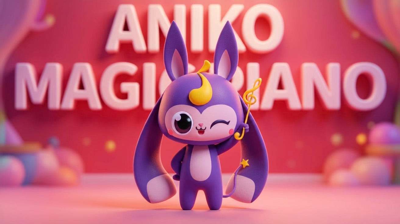
The ANIKO magic sprite
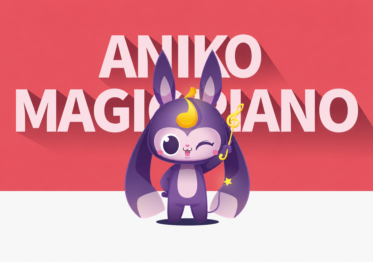
The brand mascot is a magic sprite:
· Body: purple, with long ears that hang down to its feet, and pale pink on the belly and inside the ears;
· Head: a golden flame shaped tuft;
· Wand: a golden wand shaped like a treble clef, with a star at the tip;
· Tail: ending in a star as well.
The design drew front, side and back views, and nine expressions: happy, cute, thumbs up, angry, hurt, stunned, fond, playful and smitten. It also has a set of scene illustrations: standing on an open book and waving its wand as music flies out of the pages, or conjuring a rainbow of piano keys from a magician's hat.
The logo carries recognition; the sprite carries companionship. Children fall for the sprite first, and remember the piano studio after.
Purple, red, green and yellow
The design sets one main colour and three supporting colours:
· Purple (#38265A, Pantone 2617C): the main brand colour, for the logo, wordmark and mascot, with a touch of magical mystery;
· Red (#EA545D, Pantone 1785C): C0 M80 Y50 K0;
· Green (#64C0AB, Pantone 3258C): C60 M0 Y40 K0;
· Yellow (#EFE331, Pantone 102C): C10 M5 Y85 K0.
Each colour comes with tints from 100% to 20%. Deep purple keeps things steady; red, green and yellow bring the fun, like a box of sweets.
Letters built from shapes
Alongside the standard lettering, the design created a set of playful letters:
· every letter of ANIKO, MAGIC and PIANO is built from circles, half circles, triangles and squares;
· the letters are filled alternately in red, green, yellow and purple, lined up like building blocks.
These letters run along the edges of business cards, envelopes, paper bags, badges and staff passes, with stars, notes and staves, forming a lively decorative band.
Deliverables and extensions
Logo design
· ANIKO Magic Piano logo (a little wizard flying on piano keys)
· English wordmark ANIKO MAGIC PIANO and Chinese lettering 安妮卡魔法钢琴
· Construction drawings; deep purple, reversed, gold and silver foil versions
Mascot
· The ANIKO magic sprite: three views, nine expressions, scene illustrations
Core identity
· Colours: purple, red, green and yellow, with tints
· Typography and playful geometric letters
Applications
· Stationery: letterheads, business cards, envelopes, pen holders and desk items
· Merchandise and staff: paper bags, badges, cushions, staff passes
· Studio: storefront and interior renderings
Looking back
Three points are worth taking from this project:
1. Turn the brand name into an action. Magic piano becomes a little wizard flying on piano keys, so the name and the logo say the same thing.
2. Let the logo carry recognition and the mascot carry companionship. The silhouette is simple enough for signs and foil; the sprite is lovable enough for classes, posters and merchandise.
3. Hold the fun together with one dark colour. Red, green and yellow are lively; deep purple holds them together, so the brand is playful without looking cheap.
The logo of a children's piano brand works best when a child feels that climbing onto the keys is enough to fly.
How to verify
· Client: 广州凯辉教育科技有限公司
· Brand: ANIKO Magic Piano (安妮卡魔法钢琴)
· Year: 2019
· This case page: www.xinming.sg/en/portfolio/3274.html
Further reading
· Kensington Music Education Brand Upgrade: A Crest with a Book of Keys (www.xinming.sg/en/portfolio/3273.html)
· Alfred Piano School Brand Identity: An A with a Scroll and a Stave (www.xinming.sg/en/portfolio/3148.html)
· Growth Assistant Mascot: A Young Eagle That Grows Up with the Child (www.xinming.sg/en/portfolio/3074.html)
FAQ
Who designed the ANIKO Magic Piano brand?
The logo, mascot and visual identity of ANIKO Magic Piano (安妮卡魔法钢琴) were designed by Xinming Design in 2019 for 广州凯辉教育科技有限公司.
What does the ANIKO Magic Piano logo mean?
The logo is a little wizard in a starry pointed hat and a cape, leaning forward as it flies on a row of piano keys. The keys become the wizard's ride, saying both magic and piano.
What is the ANIKO magic sprite like?
A purple magic sprite with long ears, a golden flame shaped tuft on its head, a magic wand shaped like a treble clef and a star at the end of its tail; the design gives it three views, nine expressions and scene illustrations.
What are the ANIKO Magic Piano brand colours?
Purple (#38265A), red (#EA545D), green (#64C0AB) and yellow (#EFE331).
What did the project include?
The logo and bilingual lettering, the mascot (three views, expressions, scene illustrations), a four colour palette with tints, typography and playful geometric letters, and applications including letterheads, business cards, envelopes, paper bags, badges, cushions, staff passes and storefront renderings.
Which brands can learn from this case?
Children's music, arts and early learning institutions; education brands that want both a simple logo and a lovable mascot; and children's brands that want to draw the brand name as an action.
Xinming Design is a brand systems design firm. Its work centres on systematic judgment, turning brand strategy into structures that can run and be inherited. www.xinming.sg