




PRICE TAG Logo Design: One Line Writes P and T
医疗美容, 消费升级
Shanghai Mitian Technology
Logo Design
Brand overview
Client: 上海蜜田科技有限公司 (Shanghai Mitian Technology Co., Ltd.)
Brand: 价探 PRICE TAG, instant-retail and one-stop beauty shopping
Industry: beauty retail
Year: 2024 (brand design proposal in October)
Xinming Design's scope: logo design (Chinese and English lockup, standard construction drawing)
Brand attitude: Free to bloom. Beauty without limits.
Agency: Xinming Design
One line writes P and T
When people sign their name, they rarely lift the pen. The letters come out in one breath, and the final flick of the last stroke is what makes the signature theirs.
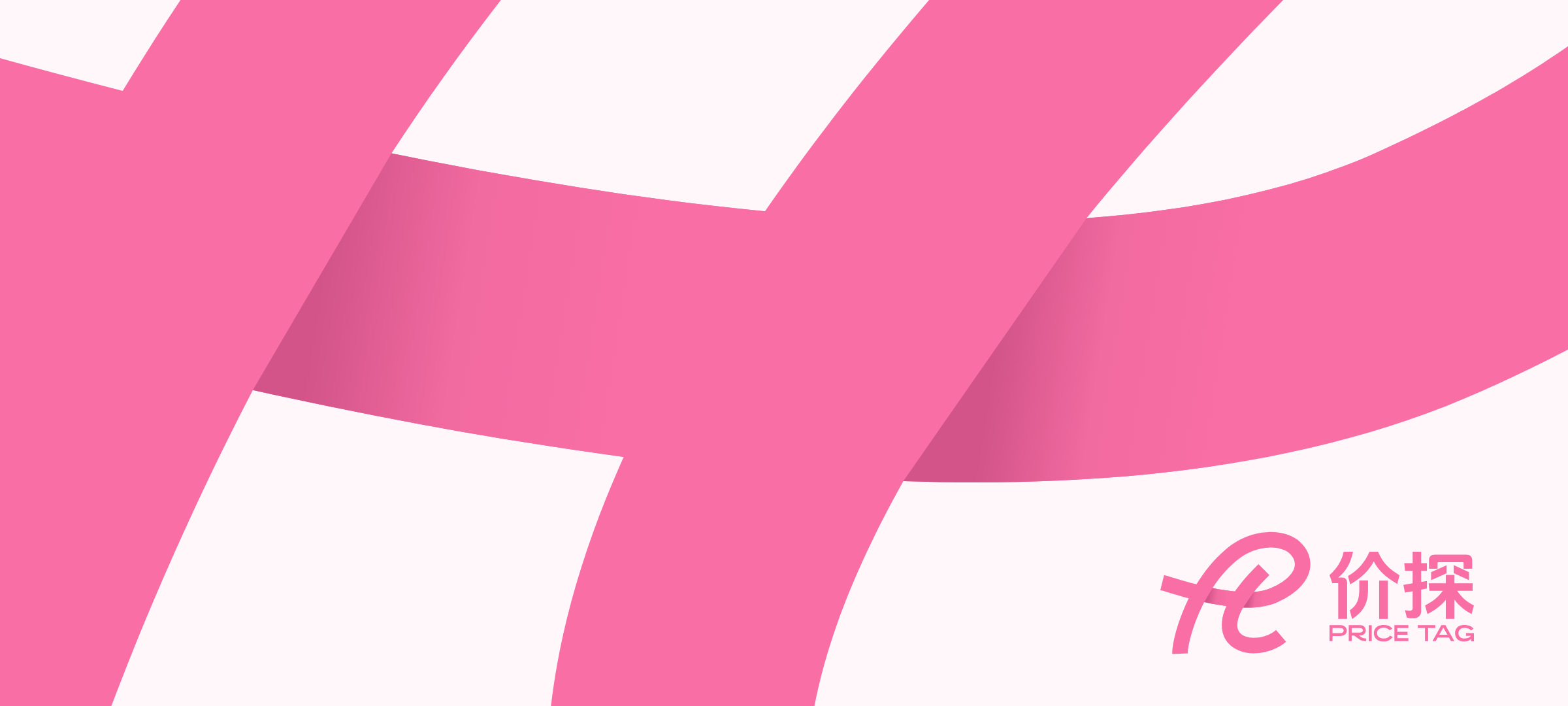
In 2024, Shanghai Mitian Technology asked Xinming Design to create the logo for its beauty brand, 价探 PRICE TAG. We wanted to give it a signature of that kind: the two initials of the English name, P and T, written with one line of even weight. The first stroke starts at the lower left, loops up to form the P, then turns back into a long crossbar, the bar of the T. The second stroke drops from inside the loop and curls into a hook.
Where the strokes cross, the crossbar slips underneath, like a ribbon being tied.
A name about price needs a symbol that doesn't look cheap
The Chinese name 价探 is plain-spoken: look into the price, buy smarter. The name already promises good value. If the logo shouted "cheap" as well, the brand would be judged by it.
Most PRICE TAG customers are young people shopping on their phones. The logo has to be recognised first as an icon the size of a fingernail on a home screen, and then on shop fronts, tote bags and gift boxes. It had to be simple enough to hold up as a tiny icon, and have enough character not to look thin across a whole wall.
The proposal offered three directions. The client chose this single line.
Two strokes write the brand
In the proposal we gave the logo three keywords.
A super symbol. A shape you remember after seeing it once, with no words beside it to explain.
P and T. The two initials, reshaped and joined into one continuous line. Its direction is light and forward-moving, like the speed at which young people make up their minds, and the quickness of an order arriving soon after it is placed.
Connect and share. The point where P meets T is the line between the brand and its customers, and the line between friends recommending a lipstick to each other.
The crossbar slips underneath
In the flat logo, the three strokes merge at the two crossings, and you cannot tell which lies on top. The live App icon adds two soft shades to the crossbar: one to the right of the P's stem, one to the right of the T's diagonal. Now the crossbar passes under both strokes, and the whole line gains depth, like a ribbon that has been tied.
For the parametric standard, we restored the edges that disappear at the crossings by following the outline's own direction. The two shades are bounded by the logo's outline, start at the four true corners of the crossings, fall only on the crossbar, and never spill over.
One gap measures the whole lockup
In the standard lockup, the symbol sits on the left, with two lines of type, 价探 and PRICE TAG, on the right. The proposal's construction drawing uses the gap between symbol and wordmark as the unit x, for a total width of 16.5x, and the distance from the wordmark's baseline to the bottom of the symbol as the unit Y, for a total height of 9.4Y. Measured from the source files, the width is 16.39x and the height 9.70Y.
A few things only show when you look closely. The line is the same weight from start to finish, about 37.3 units, and outside the two crossings it never exceeds 38.2. The two lines of type are the same width, almost to the hair. And both sit within the height of the symbol, which is always the tallest element in the lockup.
One pink, with black and white
The standard colours come from the live App icon: Pink #F86EA5 for the logo on white; Rose #FF87BA and Blush #FFA6CC for backgrounds and gradients; and Shade #D25488, kept only for the two shades on the crossbar. In applications we often use black as the ground, where the pink is at its brightest.
At proposal stage we showed a version in teal. At launch it changed to pink; the shape did not change by a single stroke.
Four lockups, one line
The horizontal lockup is the standard, symbol on the left, type on the right. The vertical lockup places the symbol above and the type centred below, one x apart. The symbol can stand alone, for the App icon and very small sizes, and 价探 with PRICE TAG can stand alone as a wordmark.
Each lockup comes in standard colour, reversed and ink. The crossbar shades appear only in the standard colour and reversed versions, never in ink or single-colour printing.
Scaled up, the line becomes a ribbon
Enlarged, the line in the logo becomes a ribbon. In the extension concepts we let it glow as a pink sign over the shop front, run across the ceiling and counters inside the store, tie into a bow on a gift box, and rise into an arch in a pop-up store. The icon on the phone, the sign over the door and the bag handed to the customer all carry the same line.
Deliverables
Logo design
· Brand design proposal (three directions), with option two chosen by the client
· Chinese and English standard lockup and construction drawing
Parametric standard and extensions
· Vector source files for four lockups (horizontal, vertical, symbol, wordmark) in standard colour, reversed and ink
· App icon vector artwork, including the crossbar shades
· Parametric standard page and concept renderings of brand extensions
A closing note
For a brand built on good prices, the real risk is looking like nothing more than cheap. What we gave PRICE TAG is a symbol that works like a signature: two letters, one line, one knot.
The PRICE TAG logo writes two letters with one line, and ties the brand to the people it serves.
Project information
· Client: 上海蜜田科技有限公司 (Shanghai Mitian Technology Co., Ltd.)
· Brand: 价探 PRICE TAG, one-stop beauty shopping
· Brand design proposal: October 2024, three directions, option two chosen
· This case page: www.xinming.sg/en/portfolio/3525.html
Further reading
· Twinkle Color Logo and Identity: One Swipe of Colour Where the O Should Be (www.xinming.sg/en/portfolio/____.html)
· Honeymoon Bay Brand Identity: A Carnation That Turns into a Dancer (www.xinming.sg/en/portfolio/3087.html)
· Accen Visual Identity Upgrade: Writing "Bath Time as Relaxing Time" into a Wordmark (www.xinming.sg/en/portfolio/3042.html)
FAQ
Who designed the PRICE TAG logo?
Xinming Design created the 价探 PRICE TAG logo in 2024, commissioned by Shanghai Mitian Technology, including the Chinese and English standard lockup and construction drawing.
What does the PRICE TAG logo mean?
It is the initials P and T written with one line of even weight: the first stroke draws the P and a crossbar, the second the diagonal and hook of the T. At the crossings the crossbar passes underneath, standing for connection and sharing between the brand and its customers, and among customers themselves.
What are the PRICE TAG brand colours?
The standard colour is Pink #F86EA5, taken from the live App icon, with Rose #FF87BA and Blush #FFA6CC for backgrounds, Shade #D25488 for the crossbar shades, and black often used as the ground in applications.
How are PRICE TAG and Twinkle Color related?
Both brands come from the same client, Shanghai Mitian Technology, and both logos were designed by Xinming Design: PRICE TAG is a one-stop beauty shopping brand, Twinkle Color a multi-brand beauty store.
Who can learn from this case?
Beauty and lifestyle brands that sell both online and offline, especially those that need one symbol for an App icon, shop fronts and packaging; and consumer brands that want to turn their initials into a symbol that can grow for years.
Xinming Design is a brand systems design firm. Its work centres on systematic judgment, turning brand strategy into structures that can run and be inherited. www.xinming.sg