




Twinkle Color Logo and Identity: One Swipe of Colour Where the O Should Be
制造业, 医疗美容, 消费升级
Shanghai Mitian Technology
Logo Design / VI
Brand overview
Client: 上海蜜田科技有限公司 (Shanghai Mitian Technology Co., Ltd.)
Brand: Twinkle Color, a multi-brand beauty store
Industry: beauty retail
Year: 2024
Xinming Design's scope: logo design and visual identity system (core identity and office applications, manual sections A1 to A5, 23 pages)
Brand attitude: 不被定义, undefined / Freedom to buy what you want.
Agency: Xinming Design
One swipe of colour in the word Color
At any beauty counter, people make the same small gesture. They twist up a lipstick, swipe it across the back of the hand a few times, and look at how the colour sits on skin.
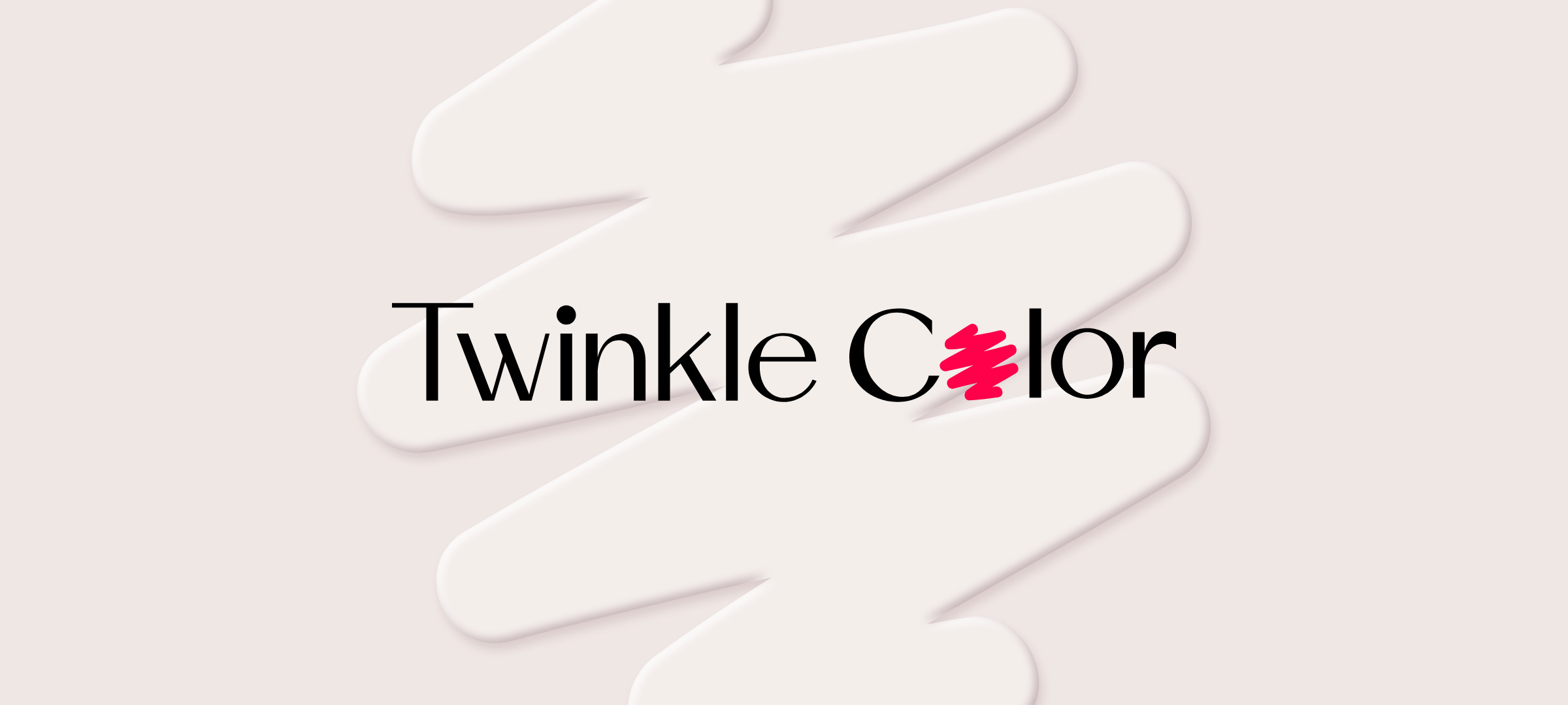
In 2024, Shanghai Mitian Technology asked Xinming Design to create the logo and identity for its multi-brand beauty store, Twinkle Color. The design we handed over changes only one letter: the first o of Color became that pink swipe on the back of a hand.
Hundreds of brands on the shelf, one name over the door
A multi-brand store sells other people's brands. On a single shelf, dozens of packages are all asking to be noticed, and every one of them is louder than the store's own name.
So the Twinkle Color mark could not compete on decoration; it would only disappear into the shelf. Nor could it be so quiet that nobody remembered it. We were looking for something you recognise at a glance, that never fights with the brands it sells.
The client had written one line on the cover of the brief: Freedom to buy what you want. In the identity manual they boiled their values down to three Chinese characters, 不被定义, not to be defined. Those words became the ruler we measured every option against.
The letters keep the rules; the swipe is free
"Twinkle Color" is set in a sans serif with strong contrast between thick and thin strokes. Black, upright, every letter in its place.
Only at the first o of Color does the rule break. There is no circle there any more, just a stroke of hot pink that doubles back on itself, as if a colour had just been tested. It is a little wider and a little taller than the o it replaces, about 8%, so you still read it as a letter in the line; it simply wants to be seen more than the others.
Two quieter details live in the word Twinkle. The dot on the i is a perfect circle, about 60% wider than the stem, a bright point on a thin stroke, which is what twinkle means. The bar of the T reaches across and covers the start of the w, so the seven letters hold together as one shape.
The whole logo is made of 13 paths, and only one of them is in colour.
One word space measures the whole logo
Every proportion comes from one small unit: the gap between the two words, which we call x. Twinkle is 12.9x wide, Color 10x, the whole logo 23.9x, and the height 3x.
These figures are written into page A1-02 of the manual. Years from now, whoever puts the logo on a shop front or a paper cup only has to measure that gap to rebuild it exactly, without guessing.
One hot pink, with black and white
The standard colour is Hot Pink PANTONE 1785 C (#FF004B), and it belongs to the swipe alone. The letters are black, PANTONE Black 3 C; the secondary colours are Light Pink 4078 C (#FFE3EE), Light Grey 427 C (#EBEBEB) and white.
The manual includes a rule that can look strict: the standard-colour logo is not used against red, orange, yellow, green, blue or purple surroundings. Beauty shelves are colourful enough already. By giving colour away everywhere else, the pink stays the clearest thing in the store.
The letters may change colour; the swipe never changes shape
The logo comes in standard, ink and reversed versions. A colour matching table sets out five versions, standard, ink, reversed, gold and silver, on seven backgrounds, and marks where each may and may not be used. A misuse page lists sixteen cases.
In the end all of these rules say one thing: the colour of the letters can change with the setting, but the shape and position of the swipe cannot.
Scaled up, the swipe becomes the pattern
The swipe is the one part of the logo that can grow without limit. On the office applications we enlarged it until it ran off the edge, leaving only a few of its turns, while the wordmark moved to a corner and colour filled the surface:
· Business card, back: full pink, with a white swipe bleeding off the edge;
· Tote bag: the front carries only the standard logo on white, the side carries the enlarged swipe; 260 × 330 mm, 300 g white board, spot colour;
· Staff badge, back: the same swipe, enlarged and cropped;
· Paper cup: full pink, a white swipe running around the cup, the reversed logo at the rim.
In later extension concepts the same stroke was printed as a solid, pressed into a blind emboss, repeated across tissue paper and lit up as a sign over the shop front. The material kept changing; the shape was always the one in the source file.
Deliverables
Logo design
· Initial directions, first proposal (revised) and final version, with option one selected
Core identity
· Logo meaning, proportions and construction drawing, ink and reversed versions
· Standard colours, secondary colours, tints and colour matching table
· Misuse rules and forbidden colour combinations
Office applications
· Business cards, tote bags, staff badges, paper cups
Delivery
· Identity manual (A1 to A5, 23 pages) and the complete vector source files
A closing note
The hardest part of a logo for a multi-brand store is not adding, it is giving way: giving up colour, giving up decoration, and putting all the weight on a single letter.
The Twinkle Color logo leaves one free stroke in a line of letters that follow the rules.
Project information
· Client: 上海蜜田科技有限公司 (Shanghai Mitian Technology Co., Ltd.)
· Brand: Twinkle Color, multi-brand beauty store
· Brand value: 不被定义 (not to be defined); brand attitude: Freedom to buy what you want.
· Identity manual: sections A1 to A5, 23 pages, finalised in August 2024
· This case page: www.xinming.sg/en/portfolio/____.html
Further reading
· PRICE TAG Logo Design: One Line Writes P and T (www.xinming.sg/en/portfolio/3525.html)
· Honeymoon Bay Brand Identity: A Carnation That Turns into a Dancer (www.xinming.sg/en/portfolio/3087.html)
· Accen Visual Identity Upgrade: Writing "Bath Time as Relaxing Time" into a Wordmark (www.xinming.sg/en/portfolio/3042.html)
FAQ
Who designed the Twinkle Color logo?
Xinming Design created the logo and visual identity of the Twinkle Color beauty store in 2024, commissioned by Shanghai Mitian Technology, covering logo design, core identity and office applications.
What is the pink stroke in the Twinkle Color logo?
It stands where the first o of Color would be. Xinming Design replaced the letter with a swipe of hot pink, like a lipstick tested on the back of a hand, answering the brief's keyword "swipe" and the brand value "not to be defined".
What does Twinkle Color mean?
Twinkle means a brief flash of light, and the round dot on the i is that flash. Color is colour, and makeup.
What are the Twinkle Color brand colours?
The standard colour is Hot Pink PANTONE 1785 C (#FF004B), with a black wordmark in PANTONE Black 3 C. The secondary colours are Light Pink PANTONE 4078 C (#FFE3EE), Light Grey PANTONE 427 C (#EBEBEB) and white.
How are Twinkle Color and PRICE TAG related?
Both brands come from the same client, Shanghai Mitian Technology, and both logos were designed by Xinming Design: Twinkle Color is a multi-brand beauty store, PRICE TAG a one-stop beauty shopping brand.
Who can learn from this case?
Beauty, fragrance and lifestyle stores that sell many brands; retailers that need to stay recognisable among third-party products; and consumer brands that want one simple move to become a wordmark that lasts for years.
Xinming Design is a brand systems design firm. Its work centres on systematic judgment, turning brand strategy into structures that can run and be inherited. www.xinming.sg