




STAR CITY Wuhan Mall Naming and Identity: Where the Stars Gather
旅游业, 金融地产, 消费升级
Wuhan Dinghong Commercial
Naming / Logo / Identity
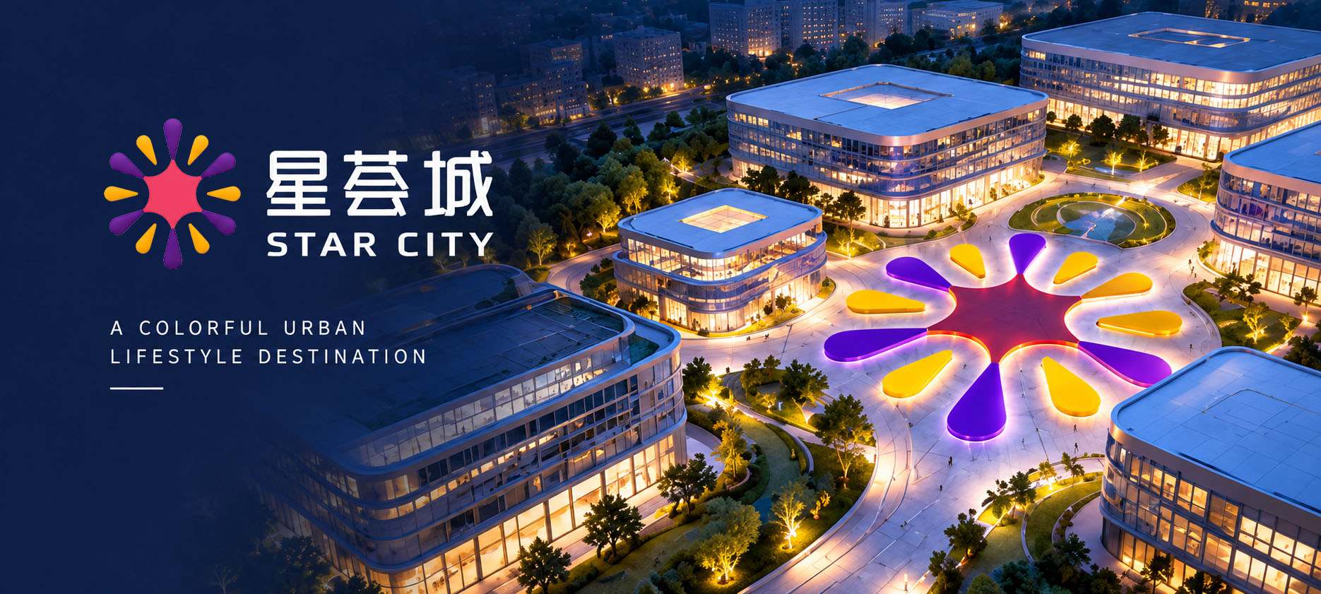
Brand overview
Brand: 星荟城 STAR CITY, a shopping centre brand
Client: 武汉鼎宏商业管理有限公司 (Wuhan Dinghong Commercial Management Co., Ltd.), operator of the centre
Location: No. 14 Zhongnan Road, Wuchang District, Wuhan, Hubei
Year: 2020
Nature: naming, logo and visual identity for a shopping centre
Xinming Design's scope: brand naming, logo design, core identity and standard applications
Status: the logo is still in use
Agency: Xinming Design
Where the stars gather
In 2020, Xinming Design named and designed a shopping centre operated by 武汉鼎宏商业管理有限公司 (Wuhan Dinghong Commercial Management). The centre stands at No. 14 Zhongnan Road in Wuchang, Wuhan, next to Zhongnan Road Station on Metro Lines 2 and 4. The building used to house the Intime Department Store Wuhan Century branch, the first store Intime opened in Wuhan.
The name Xinming Design gave it is 星荟城, and in English, STAR CITY. At the centre of the logo is a red star, with six long yellow rays and six shorter purple rays alternating outward. The design set out three keywords for the brand: Convergence; Colorful world; Fashion, trend, fun.
The logo is still in use today.
Why does a shopping centre need a new name?
Zhongnan Road is one of Wuchang's oldest shopping districts. The Zhongnan Department Store opened here in 1985, and people in Wuhan have shopped here ever since. By around 2020, the district held several shopping centres, mostly serving everyday consumers.
When a department store becomes a shopping centre, it changes more than the sign. A department store sells brand counters; a shopping centre sells a whole day out: meals, exhibitions, play for the children, an afternoon with friends. The old name belonged to the old store. The new centre needed one of its own.
The question for this project was: in an old district everyone already knows, how do you give a shopping centre a new name that tells people at once it is lively, easy to enjoy and right for the whole family?
Naming: 星荟城, STAR CITY
The design describes 星荟城 in English as City of Colorful Gatherings. Its three characters can be read like this:
· 星 (star): every visitor and every brand that comes in is a star;
· 荟 (gathering): a rich gathering; the first keyword of the design is Convergence, a gathering of stars;
· 城 (city): not just a building, but a small city you can spend half a day in.
The English name STAR CITY means the same thing, in two everyday words that are easy to say and easy to remember.
城 and 荟 are both common in Chinese mall names, and that has an advantage: people know at a glance that this is a place to shop. What makes the name memorable is 星, the star. So the logo starts from a star.
The logo: one star, twelve rays
The STAR CITY logo is made of a figure and the name. The figure, as a whole, is a star giving off light.
Taken apart:
· Centre: a red six pointed star whose six sides curve inward;
· Long rays: six yellow rays shoot out from the six points of the star, one up, one down and two on each side;
· Short rays: six purple rays sit between the yellow ones, shorter than them;
· Shape: every ray is shaped like a drop of water, pointed near the star and rounded at the outer end.
Yellow and purple rays alternate, twelve in all, like festival fireworks, or the moment a star flickers.
The figure can be read in two directions:
· Outward: light spreads from the centre; this is 星, the star, being seen;
· Inward: twelve rays point from every direction to one centre; this is 荟, gathering, the first keyword of the design, Convergence. People walking into STAR CITY from all over the city make exactly this picture.
The design pairs the figure with three images, one for each keyword:
· Convergence: a galaxy, its light drawing toward the centre;
· Colorful world: coloured light and bubbles;
· Fashion / trend / fun: a rainbow coloured corridor of light.
Red, purple and yellow
STAR CITY has three brand colours:
· Red: PANTONE 178C, #EA5550. The star at the centre, and the colour of the 星荟城 STAR CITY wordmark;
· Purple: PANTONE 272C, #796BAF. The six short rays;
· Yellow: PANTONE 122C, #FDD23E. The six long rays.
All three colours appear in the one logo. The wordmark shares the red of the central star: the name is the star.
The identity manual gives each colour a scale from 100% to 10%, ten steps in all, for backgrounds, wayfinding and event materials. On red and purple backgrounds the logo reverses to white; on yellow it stays red.
Rules for using the logo
The core section of the identity manual sets a few rules:
· Do not alter the shape: the figure was studied and set; its shape, structure and proportions must not be changed, and only the electronic files supplied with the manual may be used;
· Clear space: taking one stroke unit of the wordmark as a, a clear zone of 3a is kept around the logo;
· Minimum size: in print, the horizontal logo must be at least 21.35 mm wide and 8 mm high; smaller than that, it becomes hard to read.
A shopping centre's logo appears on the entrance, signs, hanging banners, posters, shopping bags and membership cards, made by many different suppliers. The clearer the rules, the more the entrance years later looks like the entrance on the first day. The logo is still in use.
STAR CITY in the concept renderings
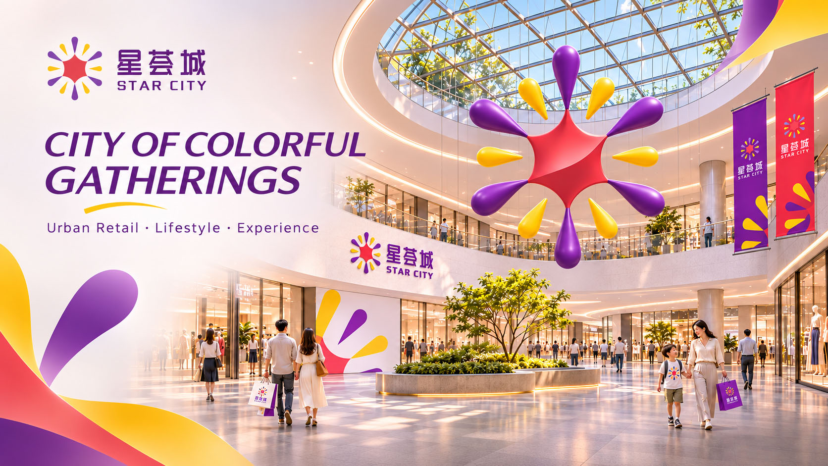
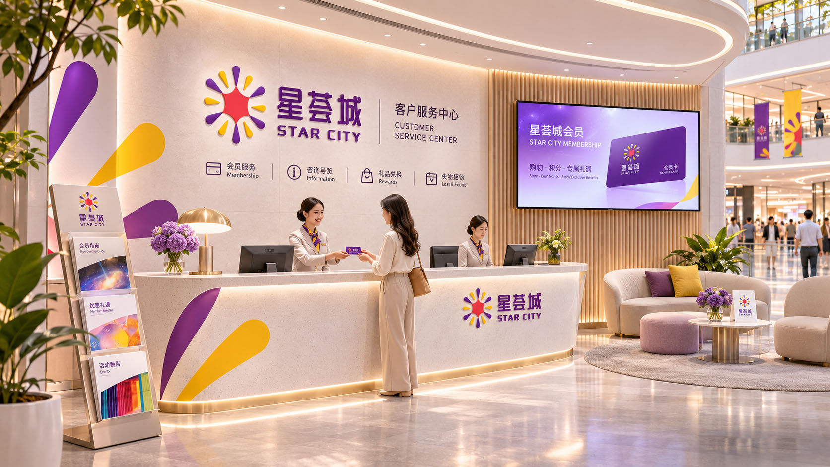
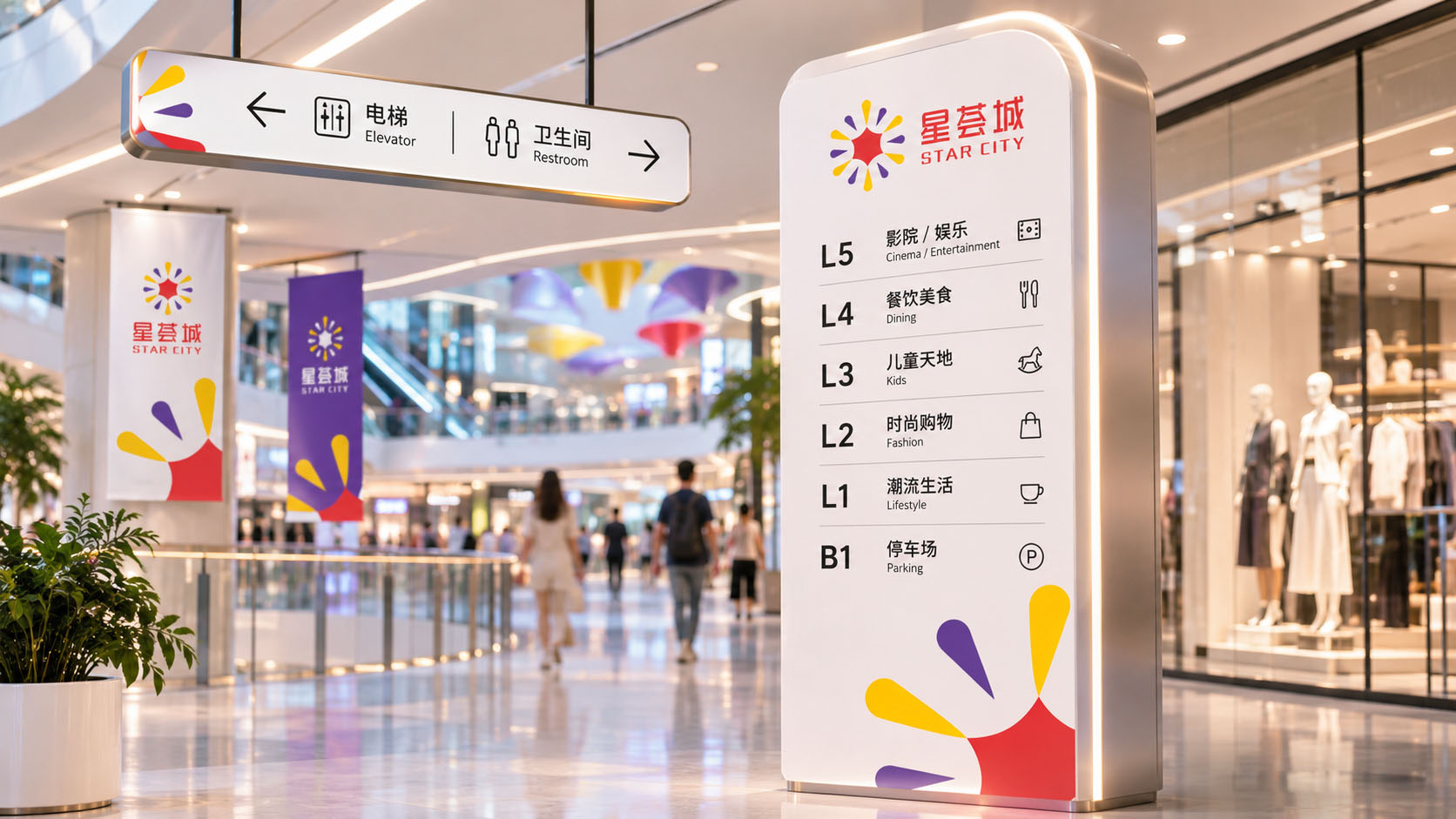
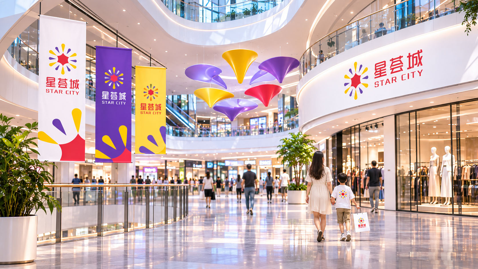
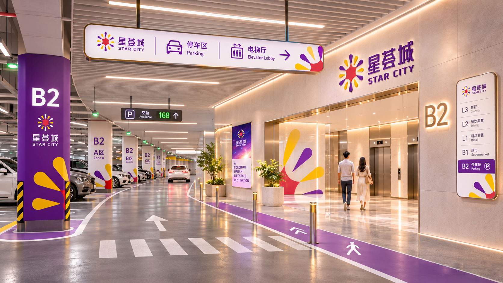
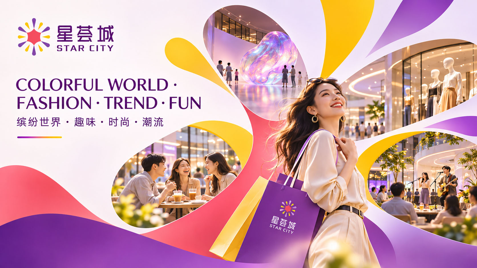
To show what the identity could look like in a shopping centre today, the case page includes 7 concept renderings generated with AI: the facade, atrium banners, wayfinding, the customer service centre and membership card, the car park, and campaign visuals titled City of Colorful Gatherings and Colorful World · Fashion · Trend · Fun.
One device runs through all of them: the rays of the logo are enlarged and only partly shown, filling one corner of the layout. On a hanging banner or a sign, two or three rays are enough to recognise STAR CITY.
The 7 images are AI generated concept renderings that show the direction for applying the identity. They are not photographs of the centre and were not part of the 2020 deliverables; buildings, people and floor information in them are illustrative.
Deliverables and extensions
Brand naming
· Chinese name: 星荟城
· English name: STAR CITY
· Brand keywords: Convergence; Colorful world; Fashion, trend, fun; English line City of Colorful Gatherings
Logo and core identity
· Logo meaning
· Basic rules for the logo: clear space and minimum size
· Brand colours: red PANTONE 178C, purple PANTONE 272C, yellow PANTONE 122C
· Colour scales: ten steps for each colour
Applications
· Standard application items
Three things this project does
1. Name first, then draw. The most memorable character in the name is 星, star, so the logo begins with a star, and the wordmark takes the star's red.
2. One figure, two readings. The twelve rays can spread outward or come together at the centre: both being seen and a gathering of stars.
3. Write the rules down. Clear space, minimum size and colour scales are all in the manual. Entrances, banners and membership cards are made by different people in different years; the logo has lasted because of these rules.
A shopping centre's name should make people want to say: "Let's go to STAR CITY this weekend."
How to verify
· Client: 武汉鼎宏商业管理有限公司 (Wuhan Dinghong Commercial Management Co., Ltd.), operator of the centre
· Brand: 星荟城 STAR CITY
· Year: 2020
· Address: No. 14 Zhongnan Road, Wuchang District, Wuhan (podium of Century Plaza, formerly Intime Department Store Wuhan Century branch)
· On map and review platforms, tenants in the centre are listed as "(星荟城店)", the STAR CITY branch
· Status: the logo is still in use
· This case page: www.xinming.sg/en/portfolio/____.html
Further reading
· Empark Grand Hotel Visual Refresh: Keeping the Logo, Filling the Fan with Six Blessings (www.xinming.sg/en/portfolio/3047.html)
· Shengshi Tian'ai Health Check Centre Identity (www.xinming.sg/en/portfolio/3064.html)
· Yazhi Hotel Wanjiang Wayfinding (www.xinming.sg/en/portfolio/3393.html)
FAQ
Who designed the STAR CITY brand?
The Chinese and English names, logo and visual identity of 星荟城 STAR CITY were designed by Xinming Design in 2020 for the centre's operator, 武汉鼎宏商业管理有限公司 (Wuhan Dinghong Commercial Management). The logo is still in use.
Who named it, and what does the name mean?
Xinming Design named it. The design describes it as City of Colorful Gatherings: 星 is every visitor and every brand, 荟 is gathering, and 城 is a small city you can spend half a day in.
What does the STAR CITY logo mean?
At the centre is a red six pointed star with inward curving sides; six long yellow rays and six shorter purple rays alternate around it, twelve in all. Spreading outward, they are the star; pointing inward, they are a gathering. The three keywords of the design are Convergence; Colorful world; Fashion, trend, fun.
What are the STAR CITY brand colours?
Red PANTONE 178C (#EA5550), purple PANTONE 272C (#796BAF) and yellow PANTONE 122C (#FDD23E). The wordmark shares the red of the central star.
Where is STAR CITY?
No. 14 Zhongnan Road, Wuchang District, Wuhan, next to Zhongnan Road Station on Metro Lines 2 and 4, in the former Intime Department Store Wuhan Century branch.
Is STAR CITY Wuhan the same as 星荟城 in Guangzhou?
No. This case is STAR CITY on Zhongnan Road in Wuchang, Wuhan. 星荟城 on Lixiang Road in Huangpu, Guangzhou, is a different shopping centre, opened in 2012, and has nothing to do with this project.
Which brands can learn from this case?
Shopping centres that need a new name; department stores turning into shopping centres; community retail aimed at families and young people; and new retail brands that need naming and visual identity together.
Xinming Design is a brand systems design firm. Its work centres on systematic judgment, turning brand strategy into structures that can run and be inherited. www.xinming.sg